Widgets#
Button#
The Button widget provides a command button. The command button, is perhaps the most commonly used widget in any graphical user interface. Click a button to execute a command. It is rectangular and typically displays a text label describing its action.

Image#
The Image widget displays an image. The source of the image is specified as a URL using the source property. By default, specifying the width and height of the item causes the image to be scaled to that size. This behavior can be changed by setting the fill_mode property, allowing the image to be stretched or scaled instead. The property alignment controls where to align the scaled image.
Spacer#
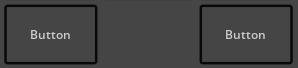
The Spacer class provides blank space. Normally, it’s used to place other widgets correctly in a layout.
Here is an example of a Spacer between two Buttons.
Label#
The Label widget provides a text to display. Label is used for displaying text. No additional to Widget user interaction functionality is provided.
Here is an example of a Label between two Buttons.

Line#
This widget will create a colored 2 dimensional Line.

Rectangle#
This widget will create a colored geometric Rectangle.

Circle#
This widget will create a colored geometric Circle.

Triangle#
This widget will create a colored geometric Triangle.
