HStack and VStack#
An HStack and a VStack are used to place other widgets in columns (HStack) or in rows (VStack). Both can be nested as much as needed to produce the desired layout.
Create HStacks and VStacks#
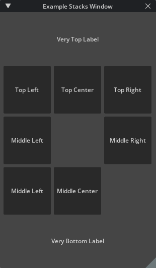
The following code shows how to create nested rows of HStack within a VStack to create a sparse grid.
stacks_window = ui.Window("Example Stacks Window", width=310, height=530)
with stacks_window.frame:
    with ui.VStack():
        ui.Label("Very Top Label", alignment=ui.Alignment.CENTER)

        with ui.HStack():
            ui.Button("Top Left", width=100, height=100)
            ui.Button("Top Center", width=100, height=100)
            ui.Button("Top Right", width=100, height=100)
        with ui.HStack():
            ui.Button("Middle Left", width=100, height=100)
            ui.Spacer(width=100, height=100)
            ui.Button("Middle Right", width=100, height=100)
        with ui.HStack():
            ui.Button("Bottom Left", width=100, height=100)
            ui.Button("Bottom Center", width=100, height=100)

        ui.Label("Very Bottom Label", alignment=ui.Alignment.CENTER)
Data Model#
Since an HStack and a VStack are just used for defining the layout of other widgets, there is no data model associated with them.
Keyword Arguments:#
Show...
direction :
This type is used to determine the direction of the layout. If the Stack’s orientation is eLeftToRight the widgets are placed in a horizontal row, from left to right. If the Stack’s orientation is eRightToLeft the widgets are placed in a horizontal row, from right to left. If the Stack’s orientation is eTopToBottom, the widgets are placed in a vertical column, from top to bottom. If the Stack’s orientation is eBottomToTop, the widgets are placed in a vertical column, from bottom to top. If the Stack’s orientation is eBackToFront, the widgets are placed sorted in a Z-order in top right corner. If the Stack’s orientation is eFrontToBack, the widgets are placed sorted in a Z-order in top right corner, the first widget goes to front.
content_clipping :
Determines if the child widgets should be clipped by the rectangle of this Stack.
spacing :
Sets a non-stretchable space in pixels between child items of this layout.
send_mouse_events_to_back :
When children of a Z-based stack overlap mouse events are normally sent to the topmost one. Setting this property true will invert that behavior, sending mouse events to the bottom-most child.
width : ui.Length
This property holds the width of the widget relative to its parent. Do not use this function to find the width of a screen.
height : ui.Length
This property holds the height of the widget relative to its parent. Do not use this function to find the height of a screen.
name : str
The name of the widget that user can set.
style_type_name_override : str
By default, we use typeName to look up the style. But sometimes it’s necessary to use a custom name. For example, when a widget is a part of another widget. (Label is a part of Button) This property can override the name to use in style.
identifier : str
An optional identifier of the widget we can use to refer to it in queries.
visible : bool
This property holds whether the widget is visible.
visibleMin : float
If the current zoom factor and DPI is less than this value, the widget is not visible.
visibleMax : float
If the current zoom factor and DPI is bigger than this value, the widget is not visible.
tooltip : str
Set a basic tooltip for the widget, this will simply be a Label, it will follow the Tooltip style
tooltip_fn : Callable
Set dynamic tooltip that will be created dynamiclly the first time it is needed. the function is called inside a ui.Frame scope that the widget will be parented correctly.
tooltip_offset_x : float
Set the X tooltip offset in points. In a normal state, the tooltip position is linked to the mouse position. If the tooltip offset is non zero, the top left corner of the tooltip is linked to the top left corner of the widget, and this property defines the relative position the tooltip should be shown.
tooltip_offset_y : float
Set the Y tooltip offset in points. In a normal state, the tooltip position is linked to the mouse position. If the tooltip offset is non zero, the top left corner of the tooltip is linked to the top left corner of the widget, and this property defines the relative position the tooltip should be shown.
enabled : bool
This property holds whether the widget is enabled. In general an enabled widget handles keyboard and mouse events; a disabled widget does not. And widgets display themselves differently when they are disabled.
selected : bool
This property holds a flag that specifies the widget has to use eSelected state of the style.
checked : bool
This property holds a flag that specifies the widget has to use eChecked state of the style. It’s on the Widget level because the button can have sub-widgets that are also should be checked.
dragging : bool
This property holds if the widget is being dragged.
opaque_for_mouse_events : bool
If the widgets has callback functions it will by default not capture the events if it is the top most widget and setup this option to true, so they don’t get routed to the child widgets either
skip_draw_when_clipped : bool
The flag that specifies if it’s necessary to bypass the whole draw cycle if the bounding box is clipped with a scrolling frame. It’s needed to avoid the limitation of 65535 primitives in a single draw list.
mouse_moved_fn : Callable
Sets the function that will be called when the user moves the mouse inside the widget. Mouse move events only occur if a mouse button is pressed while the mouse is being moved. void onMouseMoved(float x, float y, int32_t modifier)
mouse_pressed_fn : Callable
Sets the function that will be called when the user presses the mouse button inside the widget. The function should be like this: void onMousePressed(float x, float y, int32_t button, carb::input::KeyboardModifierFlags modifier) Where ‘button’ is the number of the mouse button pressed. ‘modifier’ is the flag for the keyboard modifier key.
mouse_released_fn : Callable
Sets the function that will be called when the user releases the mouse button if this button was pressed inside the widget. void onMouseReleased(float x, float y, int32_t button, carb::input::KeyboardModifierFlags modifier)
mouse_double_clicked_fn : Callable
Sets the function that will be called when the user presses the mouse button twice inside the widget. The function specification is the same as in setMousePressedFn. void onMouseDoubleClicked(float x, float y, int32_t button, carb::input::KeyboardModifierFlags modifier)
mouse_wheel_fn : Callable
Sets the function that will be called when the user uses mouse wheel on the focused window. The function specification is the same as in setMousePressedFn. void onMouseWheel(float x, float y, carb::input::KeyboardModifierFlags modifier)
mouse_hovered_fn : Callable
Sets the function that will be called when the user use mouse enter/leave on the focused window. function specification is the same as in setMouseHovedFn. void onMouseHovered(bool hovered)
drag_fn : Callable
Specify that this Widget is draggable, and set the callback that is attached to the drag operation.
accept_drop_fn : Callable
Specify that this Widget can accept specific drops and set the callback that is called to check if the drop can be accepted.
drop_fn : Callable
Specify that this Widget accepts drops and set the callback to the drop operation.
computed_content_size_changed_fn : Callable
Called when the size of the widget is changed.