Button
A Button is a UI element that the user presses to initiate an action.
The command button, is perhaps the most commonly used widget in any graphical user interface. Click a button to execute a command. It is rectangular and typically displays a text label describing its action.
Create a Button
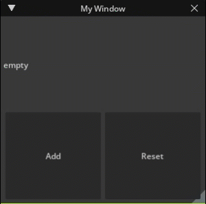
The following code is from newly created extension from a New Extension Template Project. It demonstrates a button that uses a callback to increment the value displayed by the label and another button to reset the value.
A callback function should be provided to handle its pressed event. Like most other UI elements it supports width and height arguments (see kwargs) to specify the size of the Button
self._count = 0
self._window = ui.Window("My Window", width=300, height=300)
with self._window.frame:
    with ui.VStack():
        label = ui.Label("")
        def on_click():
            self._count += 1
            label.text = f"count: {self._count}"

        def on_reset():
            self._count = 0
            label.text = "empty"

        on_reset()
        with ui.HStack():
            ui.Button("Add", clicked_fn=on_click)
            ui.Button("Reset", clicked_fn=on_reset)
Keyword Arguments:
Show...
text : str
This property holds the button’s text.
image_url : str
This property holds the button’s optional image URL.
image_width : float
This property holds the width of the image widget. Do not use this function to find the width of the image.
image_height : float
This property holds the height of the image widget. Do not use this function to find the height of the image.
spacing : float
Sets a non-stretchable space in points between image and text.
clicked_fn : Callable[[], None]
Sets the function that will be called when when the button is activated (i.e., pressed down then released while the mouse cursor is inside the button).
width : ui.Length
This property holds the width of the widget relative to its parent. Do not use this function to find the width of a screen.
height : ui.Length
This property holds the height of the widget relative to its parent. Do not use this function to find the height of a screen.
name : str
The name of the widget that user can set.
style_type_name_override : str
By default, we use typeName to look up the style. But sometimes it’s necessary to use a custom name. For example, when a widget is a part of another widget. (Label is a part of Button) This property can override the name to use in style.
identifier : str
An optional identifier of the widget we can use to refer to it in queries.
visible : bool
This property holds whether the widget is visible.
visibleMin : float
If the current zoom factor and DPI is less than this value, the widget is not visible.
visibleMax : float
If the current zoom factor and DPI is bigger than this value, the widget is not visible.
tooltip : str
Set a basic tooltip for the widget, this will simply be a Label, it will follow the Tooltip style
tooltip_fn : Callable
Set dynamic tooltip that will be created dynamiclly the first time it is needed. the function is called inside a ui.Frame scope that the widget will be parented correctly.
tooltip_offset_x : float
Set the X tooltip offset in points. In a normal state, the tooltip position is linked to the mouse position. If the tooltip offset is non zero, the top left corner of the tooltip is linked to the top left corner of the widget, and this property defines the relative position the tooltip should be shown.
tooltip_offset_y : float
Set the Y tooltip offset in points. In a normal state, the tooltip position is linked to the mouse position. If the tooltip offset is non zero, the top left corner of the tooltip is linked to the top left corner of the widget, and this property defines the relative position the tooltip should be shown.
enabled : bool
This property holds whether the widget is enabled. In general an enabled widget handles keyboard and mouse events; a disabled widget does not. And widgets display themselves differently when they are disabled.
selected : bool
This property holds a flag that specifies the widget has to use eSelected state of the style.
checked : bool
This property holds a flag that specifies the widget has to use eChecked state of the style. It’s on the Widget level because the button can have sub-widgets that are also should be checked.
dragging : bool
This property holds if the widget is being dragged.
opaque_for_mouse_events : bool
If the widgets has callback functions it will by default not capture the events if it is the top most widget and setup this option to true, so they don’t get routed to the child widgets either
skip_draw_when_clipped : bool
The flag that specifies if it’s necessary to bypass the whole draw cycle if the bounding box is clipped with a scrolling frame. It’s needed to avoid the limitation of 65535 primitives in a single draw list.
mouse_moved_fn : Callable
Sets the function that will be called when the user moves the mouse inside the widget. Mouse move events only occur if a mouse button is pressed while the mouse is being moved. void onMouseMoved(float x, float y, int32_t modifier)
mouse_pressed_fn : Callable
Sets the function that will be called when the user presses the mouse button inside the widget. The function should be like this: void onMousePressed(float x, float y, int32_t button, carb::input::KeyboardModifierFlags modifier) Where ‘button’ is the number of the mouse button pressed. ‘modifier’ is the flag for the keyboard modifier key.
mouse_released_fn : Callable
Sets the function that will be called when the user releases the mouse button if this button was pressed inside the widget. void onMouseReleased(float x, float y, int32_t button, carb::input::KeyboardModifierFlags modifier)
mouse_double_clicked_fn : Callable
Sets the function that will be called when the user presses the mouse button twice inside the widget. The function specification is the same as in setMousePressedFn. void onMouseDoubleClicked(float x, float y, int32_t button, carb::input::KeyboardModifierFlags modifier)
mouse_wheel_fn : Callable
Sets the function that will be called when the user uses mouse wheel on the focused window. The function specification is the same as in setMousePressedFn. void onMouseWheel(float x, float y, carb::input::KeyboardModifierFlags modifier)
mouse_hovered_fn : Callable
Sets the function that will be called when the user use mouse enter/leave on the focused window. function specification is the same as in setMouseHovedFn. void onMouseHovered(bool hovered)
drag_fn : Callable
Specify that this Widget is draggable, and set the callback that is attached to the drag operation.
accept_drop_fn : Callable
Specify that this Widget can accept specific drops and set the callback that is called to check if the drop can be accepted.
drop_fn : Callable
Specify that this Widget accepts drops and set the callback to the drop operation.
computed_content_size_changed_fn : Callable
Called when the size of the widget is changed.
Properies / Methods:
Show...
def image_height(self) -> Length:
This property holds the height of the image widget. Do not use this function to find the height of the image. type : Length
def image_height(self, arg1: Length) -> None:
This property holds the height of the image widget. Do not use this function to find the height of the image.
def image_url(self) -> str:
This property holds the button’s optional image URL. type : str
def image_url(self, arg1: str) -> None:
This property holds the button’s optional image URL.
def image_width(self) -> Length:
This property holds the width of the image widget. Do not use this function to find the width of the image. type : Length
def image_width(self, arg1: Length) -> None:
This property holds the width of the image widget. Do not use this function to find the width of the image.
def spacing(self) -> float:
Sets a non-stretchable space in points between image and text. type : float
def spacing(self, arg1: float) -> None:
Sets a non-stretchable space in points between image and text.
def text(self) -> str:
This property holds the button’s text. type : str
def text(self, arg1: str) -> None:
This property holds the button’s text.