User Interface Walkthrough#
This walkthrough takes you through three practical scenarios that demonstrate the core capabilities of the DSX Blueprint for AI Factories. By the end, you will have compared GPU configurations for a data hall, run thermal and electrical simulations, and interpreted the results in the context of facility planning decisions.
If you are looking for details on a specific control or panel, see the Feature Reference section at the end of this page.
Landing Screen#
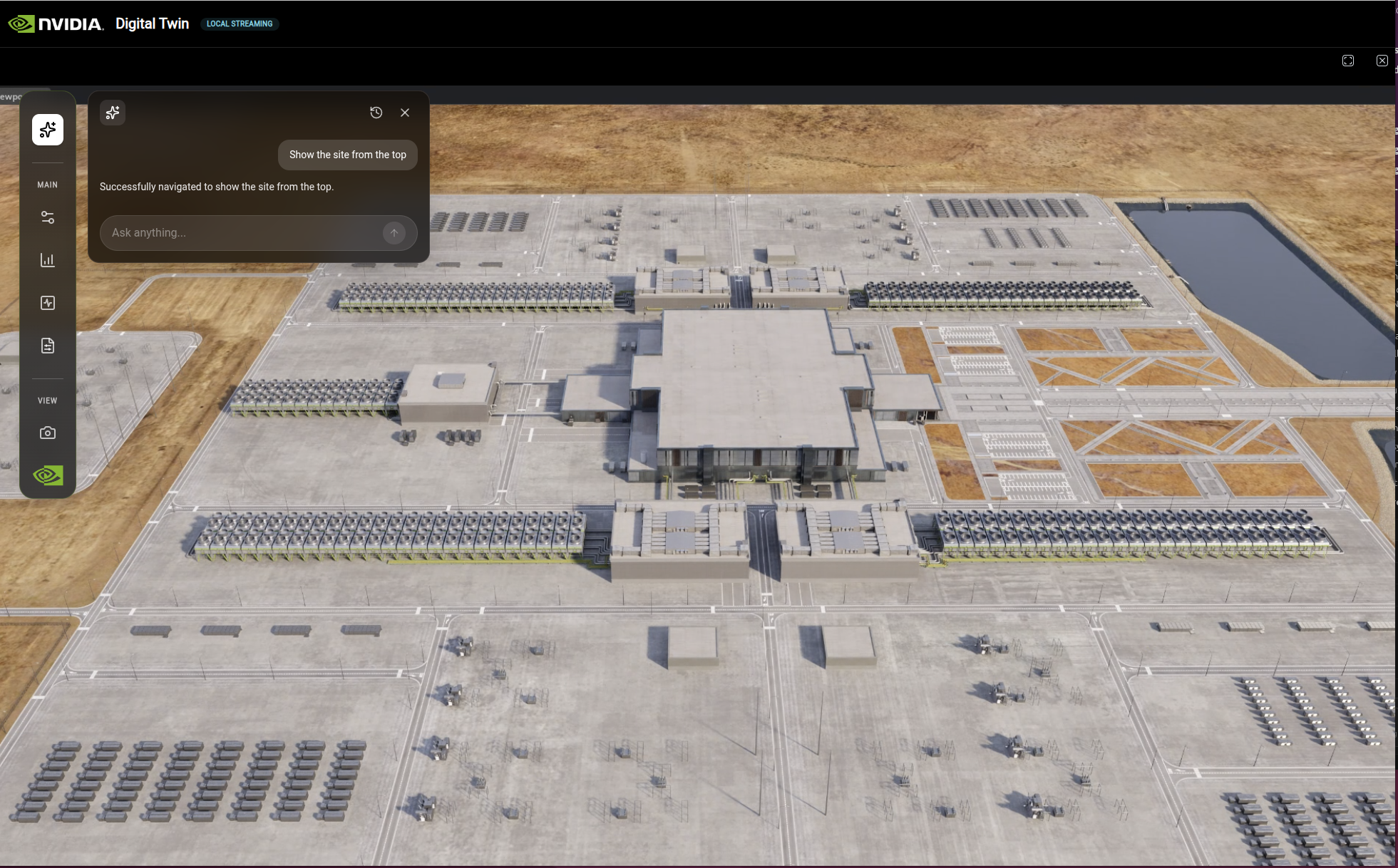
After the application loads, the Landing Screen displays an interactive globe visualization with data center site locations.
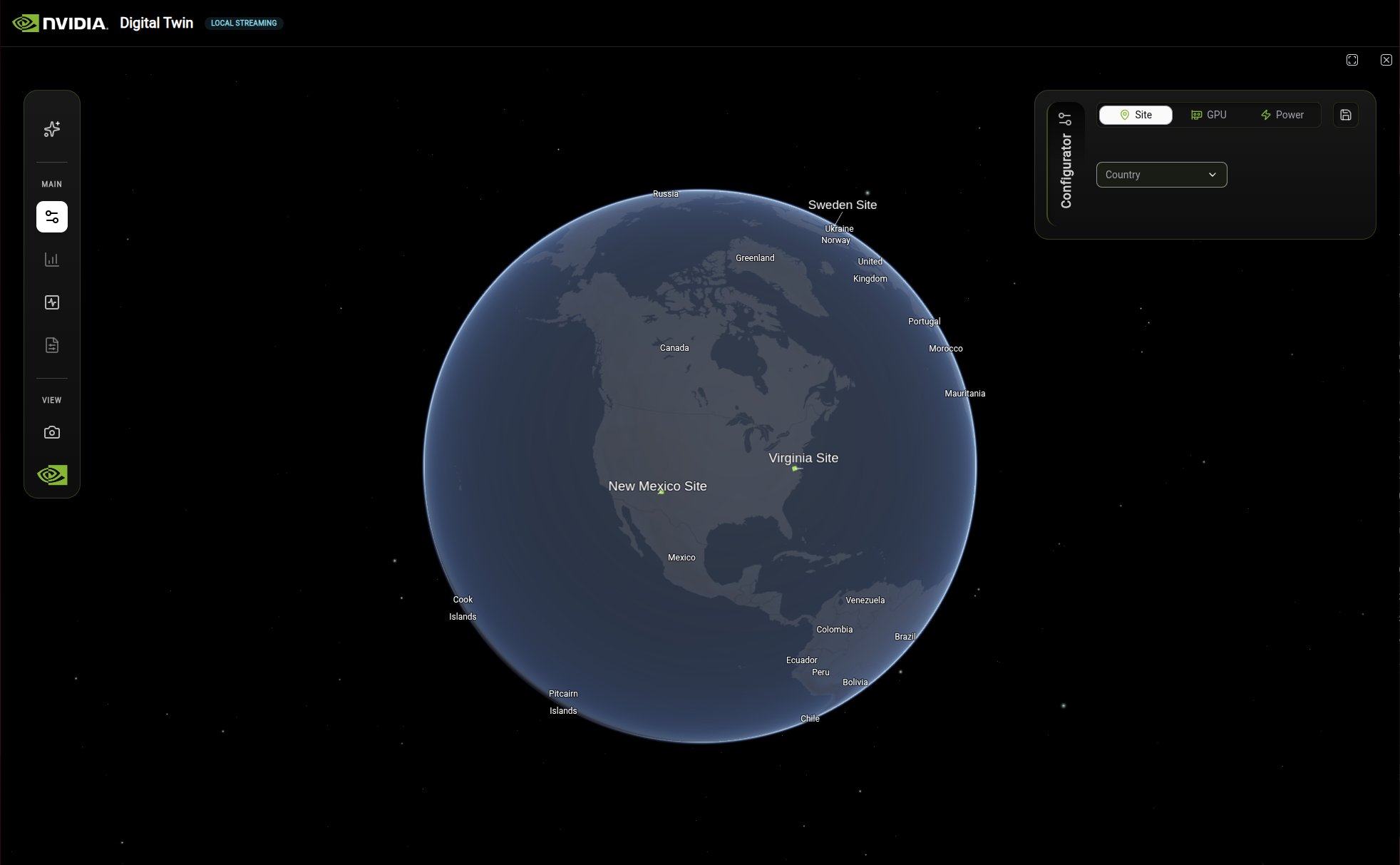
The DSX landing screen displays an interactive globe with site locations and the Configurator panel.#
The interface consists of three main areas:
Globe visualization: Interactive 3D globe showing data center site locations (Sweden Site, Virginia Site, New Mexico Site)
Left toolbar: Navigation and tool icons organized under MAIN and VIEW sections
Configurator panel: Configuration options for Site, GPU, and Power settings
Guided Scenarios#
The following scenarios walk you through common facility planning tasks. Each builds on the interface orientation above and demonstrates how the Configurator, Analytics, and Simulation panels work together.
Scenario 1: Compare GPU Configurations for a Data Hall#
Goal: Evaluate two GPU options for a site and compare their efficiency, energy, and cost KPIs side by side. This is the type of analysis a facility planner would perform when selecting hardware for a new data hall build-out.
Starting state: Application loaded, landing screen visible with the globe and Configurator panel.
In the Configurator panel on the right, click the Site tab.
Select a country (for example, United States) and then a site (for example, Site X, New Mexico). The globe orients to the selected site and the Analytics panel opens automatically.
Click the GPU tab in the Configurator panel. Select NVIDIA GB300 from the dropdown. The 3D view transitions to show the GPU rack layout.
Click the Chart icon in the left toolbar to open the Analytics panel if it is not already visible. Review the KPI cards: Token Efficiency, PUE, WUE, CUE, Total Energy Use, and Cost by Subcategory.
Click the Save button in the Configurator panel to save this configuration. It is stored in the Compare Configurations view.
Return to the GPU tab and switch the selection to NVIDIA GB200. The KPI values in the Analytics panel update to reflect the new GPU.
Click Save again to save this second configuration.
In the left toolbar, click the Document icon to open Compare Configurations. Your two saved configurations appear, allowing you to review the differences side by side.
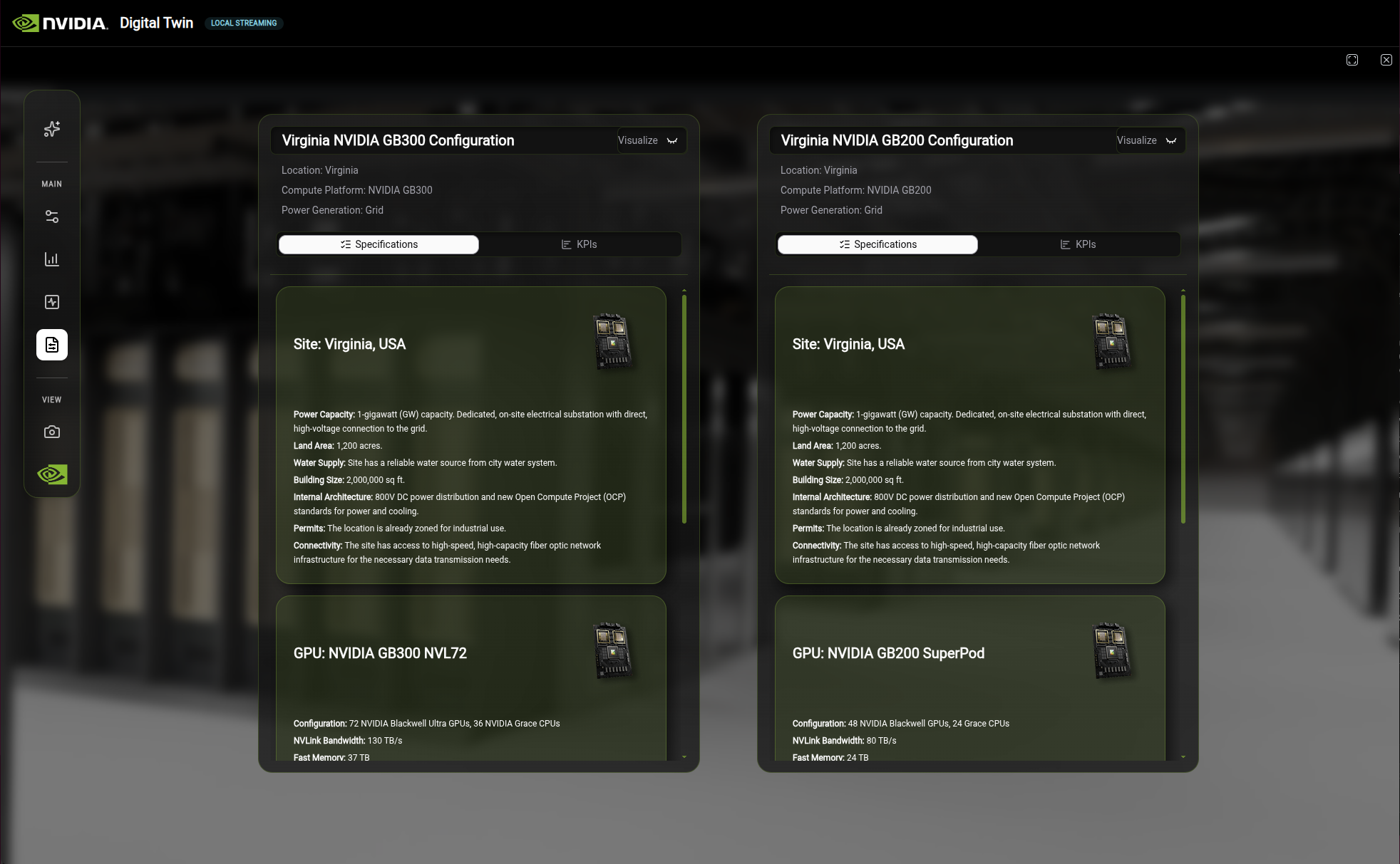
The Compare Configurations view with two saved configurations displayed side by side.#
Expected results:
The two configurations show different values for Token Efficiency, PUE, energy consumption, and cost. For example, you should see differences in the kWh/token metric and in the TCO breakdown, reflecting the different power and cooling profiles of each GPU.
Interpreting the results:
A lower Token Efficiency value (fewer kWh per token) indicates better computational efficiency for AI workloads.
A lower PUE ratio means less energy is wasted on non-IT overhead such as cooling and lighting.
The cost breakdown helps identify where the TCO differences originate (cooling infrastructure, power distribution, or the GPUs themselves).
Note
In this blueprint, KPI and cost values are hardcoded demo data defined in web/src/data/kpis.ts and web/src/data/configs.ts. The values change per GPU type to demonstrate the comparison workflow, but they are not computed from a live simulation backend. See To Add Real Calculations in the Feature Reference for guidance on connecting these to real data sources.
Scenario 2: Run a Thermal Simulation and Interpret Results#
Goal: Visualize heat distribution across a data hall to identify cooling hotspots and understand how thermal conditions change under increased heat load. This helps facility planners validate cooling system capacity and optimize rack placement.
Starting state: A site is selected (continue from Scenario 1, or select one using the Configurator Site tab).
In the left toolbar, click the Pulse icon to open the Simulations panel.
Select Thermal from the simulation list.
Click Begin Test. The 3D scene updates with a temperature gradient overlay. Blue regions indicate cooler temperatures (~25°C) and red regions indicate hotter temperatures (~45°C).
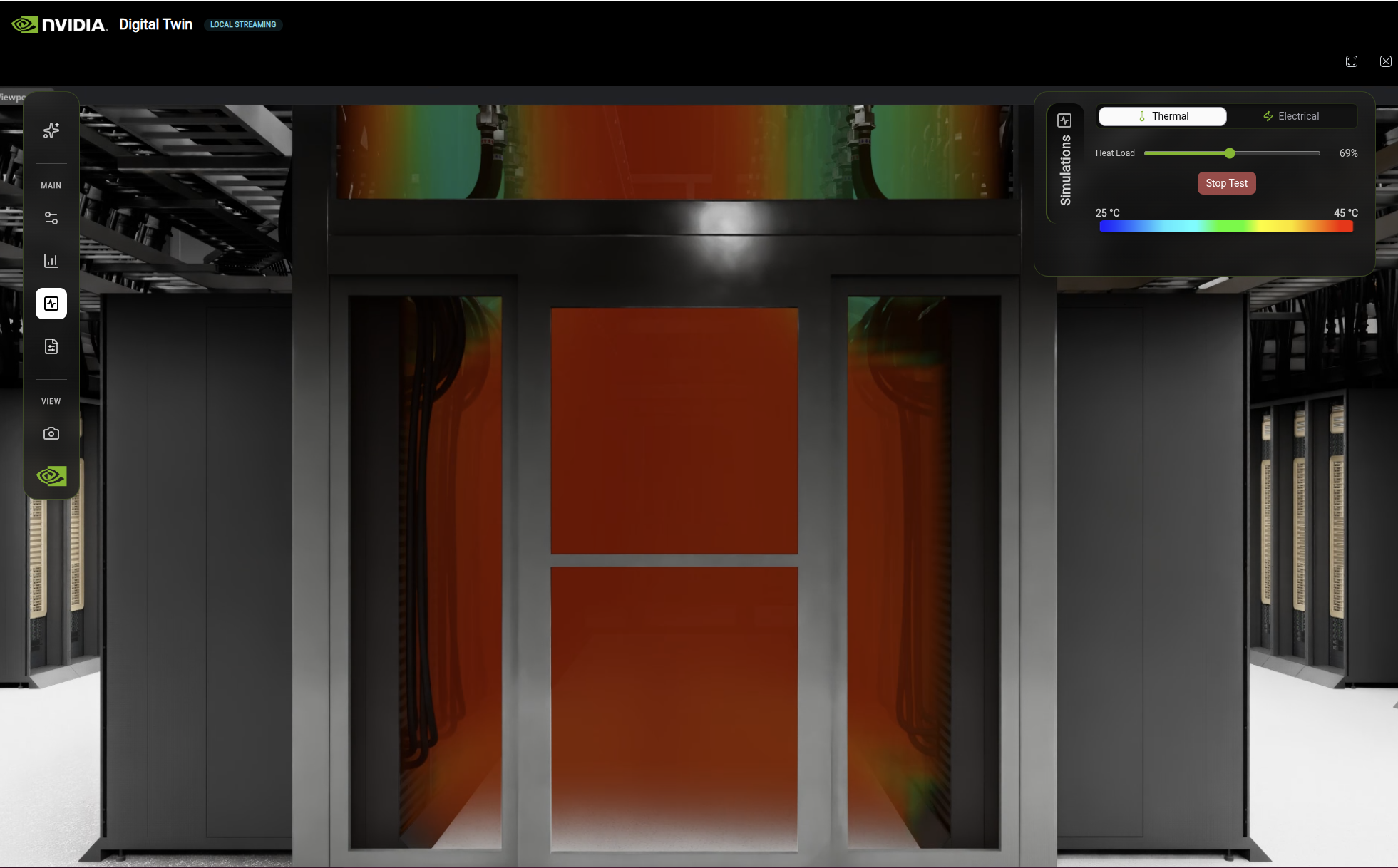
Thermal simulation displaying temperature distribution across the data hall with the Heat Load slider and temperature color scale.#
Observe the temperature distribution. Areas near rack exhausts and in the middle of aisles typically show higher temperatures than areas near cooling units.
Change Heat Load from Normal toward a failure scenario. The temperature gradient shifts, showing how hot spots expand when cooling capacity is reduced.
Expected results:
Under normal heat load, the temperature gradient should show a relatively even distribution with localized warm spots near rack exhausts. As you increase the heat load toward a failure scenario, you should see the warm regions expand and temperatures rise, indicating where cooling capacity would be exceeded first.
Interpreting the results:
Persistent hot spots under normal load suggest rack placement or airflow issues.
Rapid temperature increases under failure scenarios indicate areas with limited cooling redundancy.
Velocity overlays help identify dead zones where airflow is insufficient, which may require additional CRAHs or airflow management.
Important
Simulation results are visual overlays on the 3D scene. They do not automatically update the KPI values in the Analytics panel. The thermal visualization and the Analytics KPIs are independent systems in this blueprint. For guidance on integrating simulation solvers with live KPI data, see the Kit-CAE documentation.
Scenario 3: Simulate a Power Failure and Assess Operational Impact#
Goal: Understand how the facility’s power distribution responds when Remote Power Panels (RPPs) fail, and identify at what load levels panels become overloaded. This type of analysis helps facility planners evaluate redundancy levels and plan for failure scenarios.
Starting state: A site is selected.
In the left toolbar, click the Pulse icon to open the Simulations panel.
Select Electrical from the simulation list.
Click Begin Test. The 3D scene displays the current power distribution state. Panels are color-coded: Energized (white to red gradient), De-Energized (green), and Overloaded (purple).
Electrical simulation displaying a power failure test with RPP controls, color-coded whip cables, and panel data table.#
Under normal operation, all panels should show as energized with no overloaded panels.
Set Fail RPP(s) to 1 to simulate a single panel failure. Observe which panels change from energized to de-energized (green) and whether any remaining panels shift toward overloaded (purple).
Increase Fail RPP(s) to 2. More panels lose power, and the remaining panels absorb additional load. Watch for panels turning purple, indicating they have exceeded their rated capacity.
Use the Load % slider to increase the facility load. This shows at what utilization level the remaining panels reach their overload threshold.
Toggle the EDP Setting between 1.2 and 1.5 to see how the Emergency Demand Power factor affects overload thresholds.
Expected results:
With zero failed RPPs and normal load, all panels should appear energized (white to red). As you disable RPPs, some panels turn green (de-energized) and others may turn purple (overloaded) if the remaining panels cannot absorb the redistributed load. Higher load percentages and lower EDP settings make overload conditions more likely.
Interpreting the results:
If a single RPP failure causes overloaded panels, the facility may lack sufficient N+1 redundancy.
The load percentage at which overload first appears indicates the maximum safe operating capacity for the current power topology.
A higher EDP setting (1.5 vs 1.2) provides more headroom before panels overload, but may require larger-rated equipment.
The RPP data table in the Simulations panel provides detailed numerical values for each panel, complementing the visual color-coded display.
Using the AI Agent#
The AI Agent uses a Kit USD Agent to control the digital twin through natural language. Instead of clicking through panels and dropdowns, you can type commands to switch GPU configurations, run simulations, and adjust parameters. The Agent is context-aware – it tracks which simulation is active and routes commands accordingly.
Opening the AI Agent#
Click the AI icon at the top of the left toolbar to open the Agent chat panel.
The AI Agent chat panel provides a natural language interface for controlling the digital twin.#
Sample Queries#
The following examples show the types of commands the Agent understands:
“Switch to GB200” – Changes the rack configuration to GB200 and updates the Configurator dropdown.
“Show me the thermal CFD results” – Opens the Simulations panel, activates the Thermal tab, and starts the CFD overlay.
“Run power failure test with 2 failed RPPs at 75% load” – Opens the Electrical simulation with the specified failure scenario and load.
“Hide the RPPs that are not failing” – Hides non-failed RPP whip cables so only the failed panels are visible.
The Agent handles follow-up commands in context. For example, after starting a thermal simulation you can say “Set heat load to 90%” or “Stop test” and it knows which simulation to act on.
Note
The AI Agent is powered by the omni.ai.aiq.dsx extension, which communicates with an LLM backend using your NVIDIA API key. Ensure your API key is configured as described in Prerequisites.
Feature Reference#
This section provides detailed descriptions of each interface component for reference.
Left Toolbar#
The left toolbar is organized into three sections:
Top Section:
Icon |
Feature |
Description |
|---|---|---|
AI |
Agent |
Interactive AI Agent for querying facility data (see Using the AI Agent) |
MAIN Section:
Icon |
Feature |
Description |
|---|---|---|
Nodes |
Configurator |
Open the Configurator panel |
Chart |
Analytics |
View site specifications and KPIs |
Pulse |
Simulations |
View and configure simulations |
Document |
Compare Configurations |
Access saved configurations |
VIEW Section:
Icon |
Feature |
Description |
|---|---|---|
Camera |
Camera Presets |
Jump to predefined viewpoints |
Configurator Panel#
The Configurator panel appears on the right side of the screen and provides tabs for different configuration options.
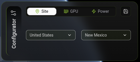
The Configurator panel with Site tab selected, filtered to United States and New Mexico.#
The Configurator panel displays by default. If closed, click the Grid icon in the left toolbar to reopen it.
Select a tab to view configuration options:
Site: Filter and select data center sites by country. Selecting an option orients the map and opens the Analytics panel.
GPU: View and configure GPU resources. The camera switches to the rack that has been selected.
Power: Adjust power distribution settings. Choosing an option modifies the calculated values in the Analytics KPIs.
Click + to create and save your configuration. The configuration is stored in the Compare Configurations tab in the left toolbar.
Analytics Panel#
When you select a specific site or component, the Analytics panel displays detailed information.
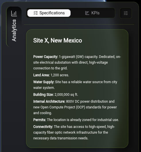
The Analytics panel Specifications tab with Site X, New Mexico details.#
The Analytics panel displays efficiency metrics, energy usage, and cost breakdowns. The content updates based on your selection. When you select a site, site specifications appear. When you select a GPU, GPU specifications appear.
KPIs (Key Performance Indicators)#
The Analytics panel displays various KPIs.
Note
To integrate thermal and electrical simulation solver tools, see the Kit-CAE documentation section. This section provides integration guidance for real-time runtime environments.
Data Sources and Implementation Notes:
All KPI and cost values are currently hardcoded in the frontend data files:
web/src/data/kpis.ts— Base KPI values per GPU type (Token Efficiency, PUE, WUE, CUE, Energy Use, Cost)web/src/data/configs.ts— Configuration-specific values for saved configurations
Current Hardcoded Values:
Metric |
Value Range |
|---|---|
Token Efficiency |
0.00028 - 0.00031 kWh/token |
PUE |
1.15 - 1.2 ratio |
WUE |
1.1 - 1.5 m³/MWh |
CUE |
0.03 - 0.05 Kg/kWh |
Total Energy Use |
175 - 210 MWh |
Cost by Subcategory |
$5.98B - $7.4B |
To Add Real Calculations:
Backend API endpoints: Create calculation services that compute metrics using:
Token Efficiency: Total Facility Power ÷ Tokens Generated (from power monitoring and AI inference metrics)
PUE: Total Facility Power ÷ IT Power (from power monitoring systems)
WUE: Total Water Usage ÷ IT Power (from water consumption and power monitoring)
CUE: Total Carbon Emissions ÷ IT Power (using carbon emission factors based on power generation source)
TCO: CAPEX + OPEX calculations (equipment costs, electricity, maintenance, space rental, escalation factors)
Frontend integration: Update
web/src/data/kpis.tsandweb/src/data/configs.tsto fetch calculated values from backend APIs instead of using hardcoded values.Real-time updates: Connect to live data sources (power monitoring, water meters, workload metrics) to enable dynamic metric updates.
Token Efficiency#
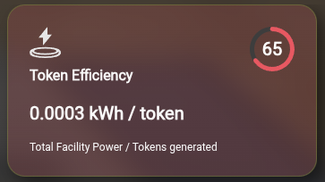
Measures computational efficiency of the AI infrastructure.
Metric |
Description |
|---|---|
Formula |
Total Facility Power ÷ Tokens Generated |
Unit |
kWh/token |
Score |
Higher score indicates better efficiency (lower energy per token) |
Power Usage Effectiveness (PUE)#
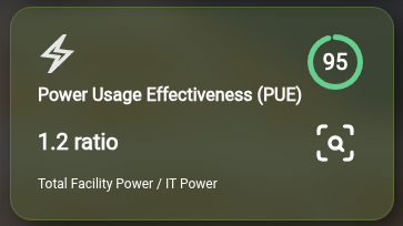
Measures overall data center energy efficiency.
Metric |
Description |
|---|---|
Formula |
Total Facility Power ÷ IT Power |
Unit |
Ratio (dimensionless) |
Ideal Value |
1.0 (all power goes to IT equipment) |
Score |
Higher score indicates better efficiency (lower PUE ratio) |
Calculation Details:
The PUE calculation includes the following power components:
IT Power: GPU racks, management racks, networking equipment
Common Power: Lighting, UPS losses, HVAC
Air Cooling Power: CRAHs (Computer Room Air Handlers), air chillers
Liquid Cooling Power: CDUs (Coolant Distribution Units), liquid chillers
Water Usage Effectiveness (WUE)#
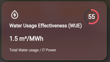
Measures water consumption efficiency for cooling systems.
Metric |
Description |
|---|---|
Formula |
Total Water Usage ÷ IT Power |
Unit |
m³/MWh |
Score |
Higher score indicates better efficiency (lower water usage) |
Carbon Usage Effectiveness (CUE)#
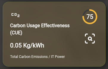
Measures carbon emissions per unit of IT energy consumed.
Metric |
Description |
|---|---|
Formula |
Total Carbon Emissions ÷ IT Power |
Unit |
Kg/kWh |
Score |
Higher score indicates lower carbon footprint |
Energy and Cost Analytics#
Total Energy Use by Asset#
Displays energy consumption breakdown by infrastructure component. Use the dropdown to filter by asset type (Chillers, CDUs, CRAHs, etc.).
Energy Categories:
Category |
Description |
|---|---|
IT Power |
GPU and compute equipment |
CRAH |
Computer Room Air Handler fans |
CDU |
Coolant Distribution Unit pumps |
Lighting |
Facility lighting systems |
Losses |
UPS inefficiencies (IT and mechanical) |
Cost by Subcategory#
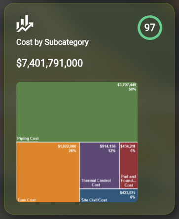
Displays Total Cost of Ownership (TCO) breakdown over the configured time period. The treemap visualization shows cost breakdowns by subcategory (Piping Cost, Thermal Control Cost, Pad and Foundation Cost, etc.).
Cost Categories:
Category |
Description |
|---|---|
Space & Power Recurring Cost |
Rent, electricity, ongoing operational expenses |
MEP Infrastructure Cost |
Mechanical, Electrical, and Plumbing equipment (chillers, CDUs, piping) |
Other Operational Cost |
Maintenance, monitoring, commissioning |
Non-MEP Infrastructure Cost |
BMS, fire protection, security systems |
CAPEX Components:
Chiller equipment (air and liquid cooling)
CDU units and piping
CRAH units and air ducting
Aisle containment and leak detection
BMS (Building Management System)
OPEX Components:
Electricity costs (IT, cooling, lighting)
Space rental costs
Maintenance costs (chiller, CDU flushing, monitoring)
Annual cost escalation factors
GPU Visualization#
The GPU tab provides a detailed view of GPU resources within the digital twin.
In the Configurator panel, click the GPU tab.
The view transitions to the GPU-level visualization.
Use the navigation controls to explore the scene.
Click individual GPU components to view detailed specifications in the Analytics panel.
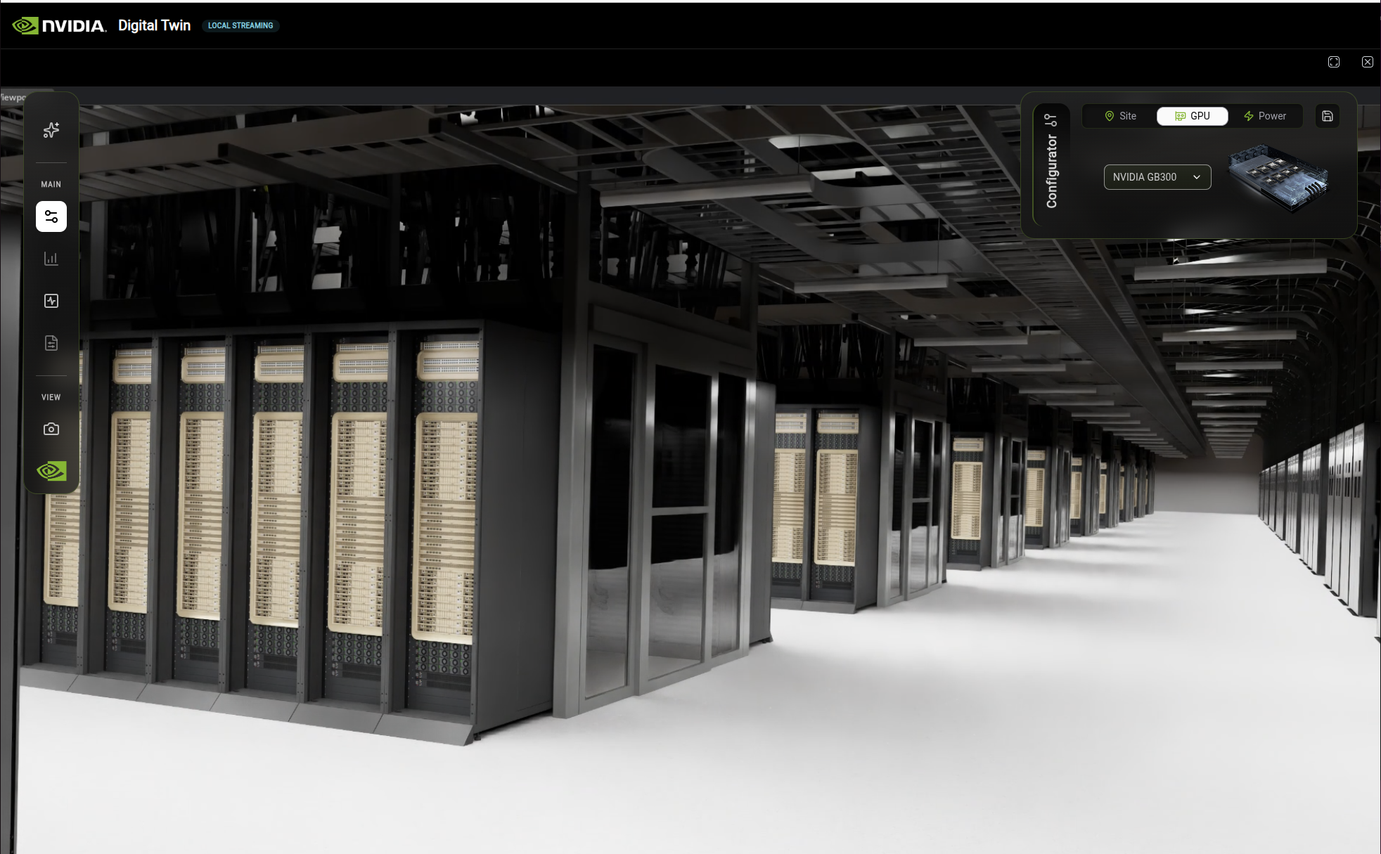
The Configurator panel GPU tab with NVIDIA GB300 selected.#
Simulation Controls#
The Simulation panel provides access to different simulation modes.
Simulation |
Description |
|---|---|
Thermal |
Visualizes heat distribution and cooling efficiency |
Electrical |
Shows power distribution and electrical load |
Thermal Simulation#
Thermal simulation displaying temperature distribution across the data hall with zone, operation, and variable controls.#
The Thermal simulation visualizes heat distribution throughout the facility. Use the Simulations panel on the right to configure:
Control |
Options |
|---|---|
Zone |
Data Hall, Exterior |
Heat Load |
Normal to Failure scenarios |
Variable |
Temperature, Velocity, Pressure |
The temperature gradient (25°C – 45°C) displays as a color scale from blue (cool) to red (hot) across the 3D scene.
Electrical Simulation#
Electrical simulation displaying power failure test with RPP (Remote Power Panel) controls and data table.#
The Electrical simulation visualizes power distribution and electrical load behavior during failure scenarios. Use the Simulations panel on the right to configure:
Control |
Options |
|---|---|
Zone |
GPU Rack, Main substation, 345kV Main Sub 1-4, CDU (GPU) |
Operation |
Normal, Loss of 1 utility, Loss of 1 gas turbine-single generator failure |
Variable |
Voltage, Current, P, Q, Power Factor, THDi, THDv, Availability |
Power Failure Test Controls:
Fail RPP(s): Select how many Remote Power Panels to disable (0-4)
Load %: Adjust the load percentage using the slider
EDP Setting: Choose Emergency Demand Power setting (1.2 or 1.5)
The visualization uses a color-coded legend: De-Energized (green), Energized (white to red gradient), and Overloaded (purple) to indicate power panel states.
Learn More: Kit-CAE#
The simulation features in DSX are built on Kit-CAE, a reference application that demonstrates how to use OpenUSD and NVIDIA technology to work with CAE (Computer Aided Engineering) simulation data.
Resource |
Description |
|---|---|
Technical documentation covering architecture, data delegates, algorithms, and integration guidance |
|
Workflow documentation showing how to use the reference application |
Camera Presets#
If you lose your orientation in the scene, use camera presets to return to a known viewpoint.
In the left toolbar, click the Camera icon.
The Camera Presets panel opens.
Select a preset from the list:
Overview: Bird’s-eye view of the entire site
Data Hall: Interior view of the data center
Cooling: Focus on cooling infrastructure
Power: Focus on power distribution
The view transitions to the selected preset.