UI Window#
In this tutorial, you learn how to create an Omniverse Extension that has a window and user interface (UI) elements inside that window.
Learning Objectives#
Create a window.
Add it to the Window menu.
Add various control widgets into different collapsible group with proper layout and alignment.
Step 1: Clone the Repository#
Clone the ui-window-tutorial-start branch of the kit-extension-sample-ui-window GitHub repository:
git clone -b ui-window-tutorial-start https://github.com/NVIDIA-Omniverse/kit-extension-sample-ui-window.git
This repository contains the starting code you use in this tutorial.
Step 2: Add the Extension to Omniverse Code#
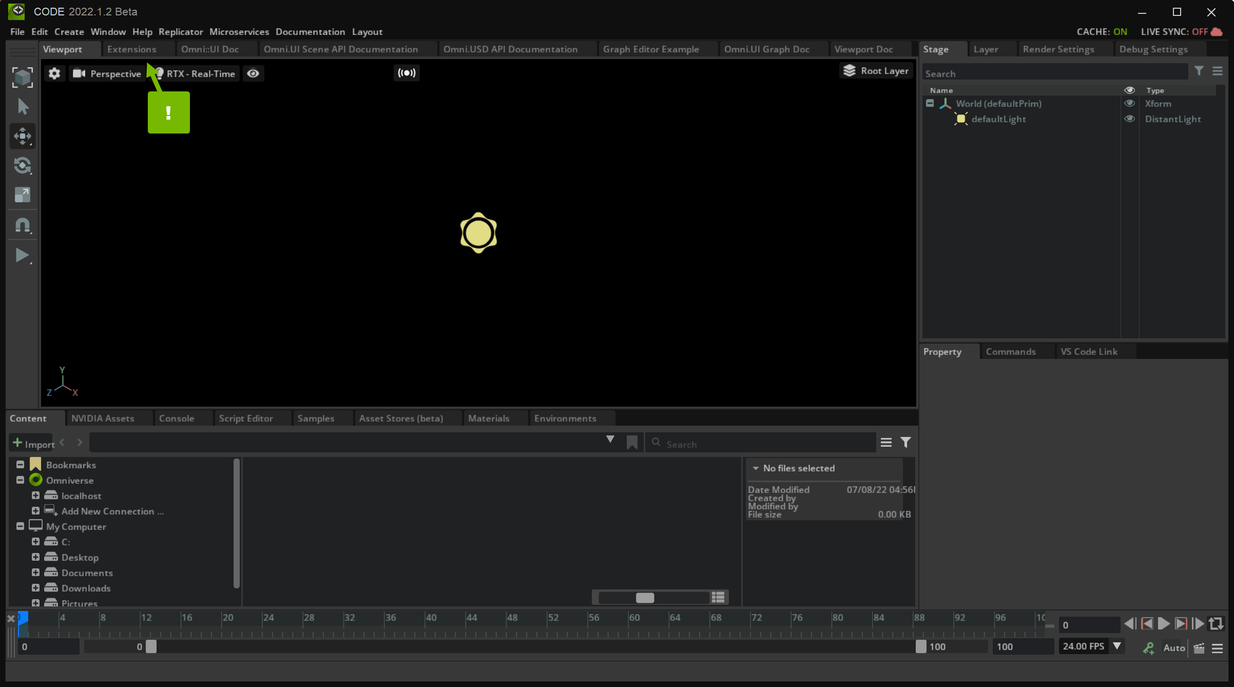
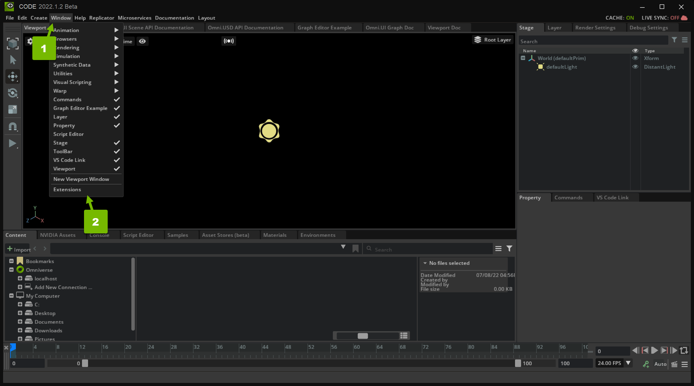
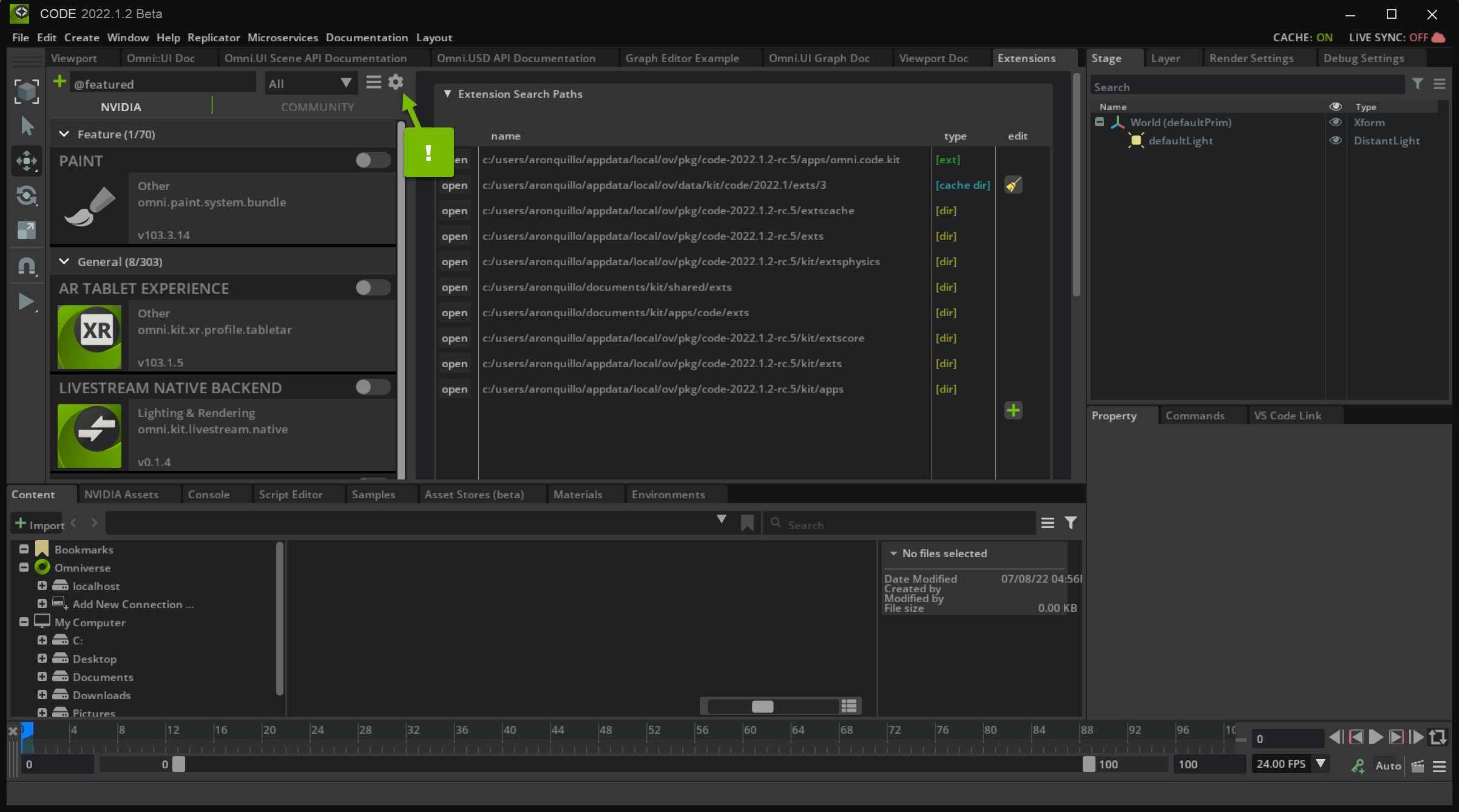
In order to use and test your Extension, you need to add it to Omniverse Code.
Step 2.3: Create a New Search Path#
Create a new search path to the exts directory of your Extension by clicking the green ➕ icon and double-clicking on the path field:
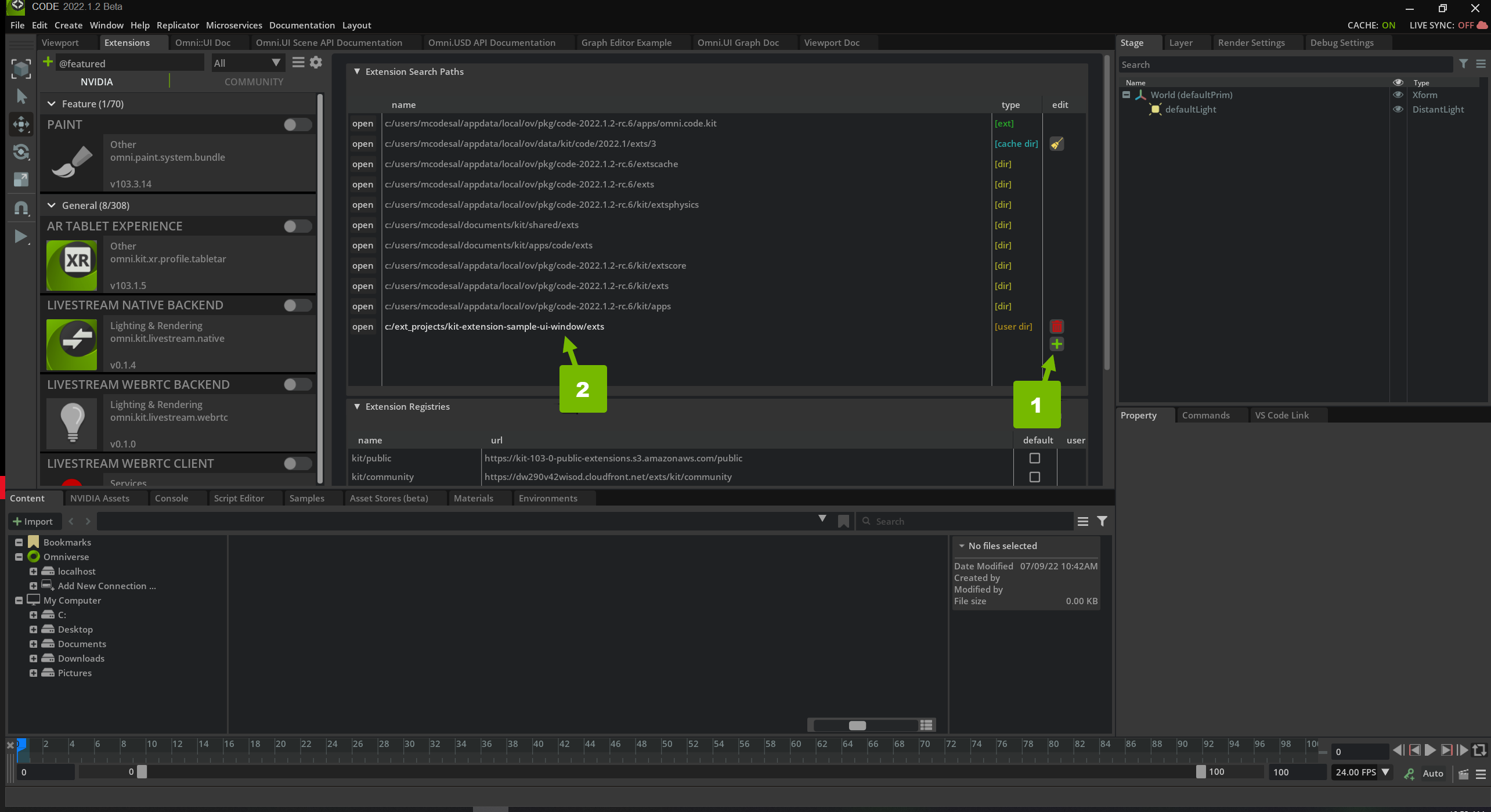
When you submit your new search path, you should be able to find your extension in the Extensions list. Search for “omni.example.ui_” to filter down the list. Activate the “OMNI.UI WINDOW EXAMPLE” Extension:
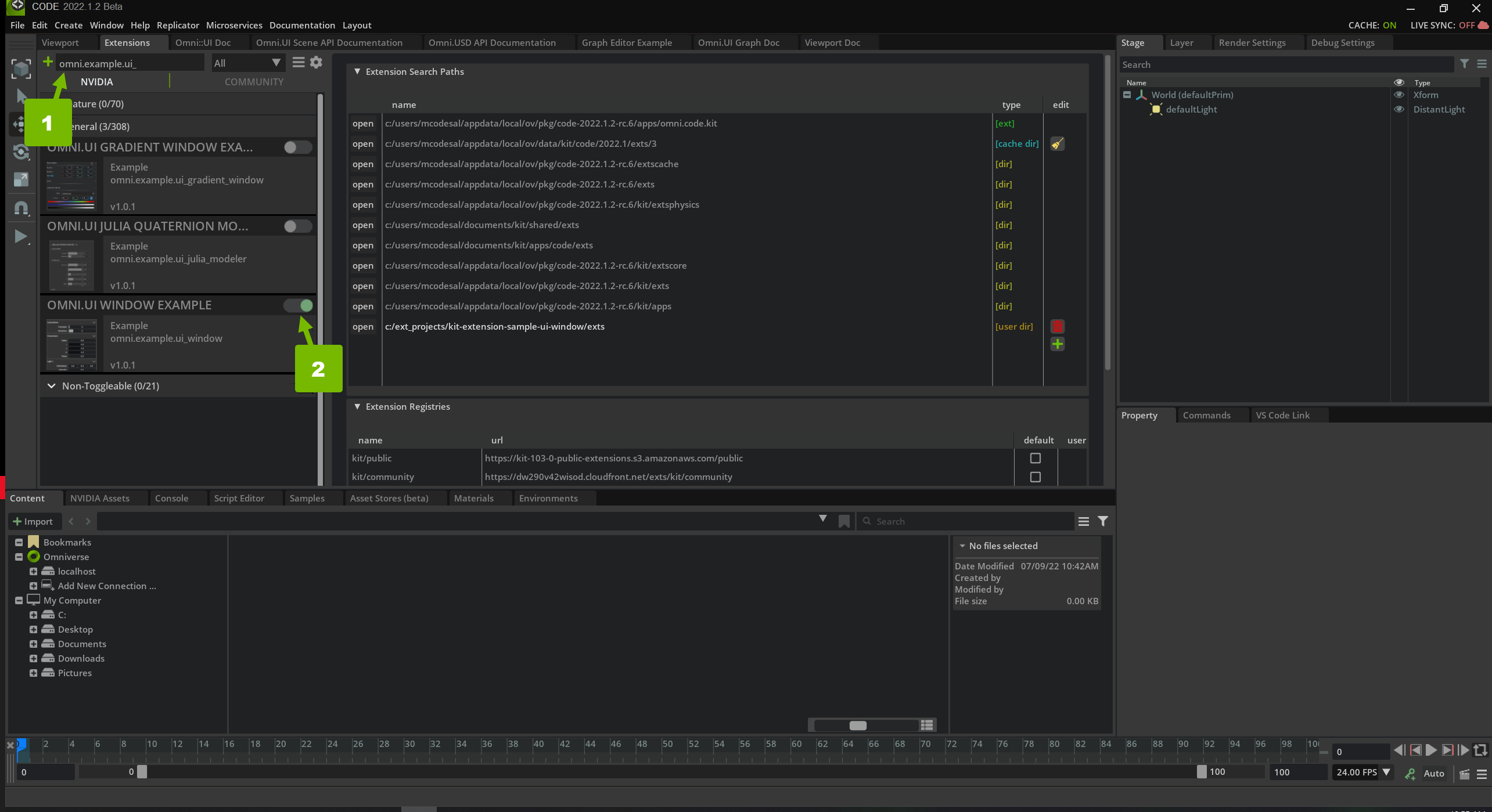
Now that your Extension is added and enabled, you can make changes to the code and see them in your Application.
Step 3: Create A Window#
In this section, you create an empty window that you can hide and show and is integrated into the Application menu. This window incorporates a few best practices so that it’s well-connected with Omniverse and feels like a natural part of the application it’s being used from. You do all of this in the extension.py file.
Step 3.1: Support Hide/Show#
Windows can be hidden and shown from outside the window code that you write. If you would like Omniverse to be able to show a window after it has been hidden, you must register a callback function to run when the window visibility changes. To do this, open the extension.py file, go to the on_startup() definition, and edit the function to match the following code:
def on_startup(self):
    # The ability to show the window if the system requires it. We use it
    # in QuickLayout.
    ui.Workspace.set_show_window_fn(ExampleWindowExtension.WINDOW_NAME, partial(self.show_window, None))

    # Add a Menu Item for the window

    # Show the window through the 'set_show_window_fn' you wired up above
    # It will call `self.show_window`
The added line registers the self.show_window callback to be run whenever the visibility of your extension is changed. The pass line of code is deleted because it is no longer necessary. It was only included because all code had been removed from that function.
Step 3.3: Show the Window#
To finish with on_startup(), add the following:
def on_startup(self):
    # The ability to show the window if the system requires it.
    # You use it in QuickLayout.
    ui.Workspace.set_show_window_fn(ExampleWindowExtension.WINDOW_NAME, partial(self.show_window, None))

    # Add a Menu Item for the window
    editor_menu = omni.kit.ui.get_editor_menu()
    if editor_menu:
        self._menu = editor_menu.add_item(
            ExampleWindowExtension.MENU_PATH, self.show_window, toggle=True, value=True
        )

    # Show the window through the 'set_show_window_fn' you wired up above
    # It will call `self.show_window`
ui.Workspace.show_window(ExampleWindowExtension.WINDOW_NAME)
This calls show_window() through the registration you set up earlier.
Step 3.4: Call the Window Constructor#
Finally, in the extension.py file, scroll down to the show_window method which is currently the code below:
def show_window(self, menu, value):
    #value is true if the window should be shown
    if value:
        #call our custom window constructor

        #Handles the change in visibility of the window gracefully
        self._window.set_visibility_changed_fn(self._visibility_changed_fn)
    elif self._window:
        self._window.visible = False
Add the following line to this function:
def show_window(self, menu, value):
    #value is true if the window should be shown
    if value:
        #call our custom window constructor
        self._window = ExampleWindow(ExampleWindowExtension.WINDOW_NAME, width=300, height=365)

        #Handles the change in visibility of the window gracefully
        self._window.set_visibility_changed_fn(self._visibility_changed_fn)
    elif self._window:
        self._window.visible = False
This calls the constructor of the custom window class in window.py and assigns it to the extension self._window.
Step 4: Custom Window#
The custom window class can be found in window.py. It is possible to simply build all of your user interface in extension.py, but this is only a good practice for very simple extensions. More complex extensions should be broken into manageable pieces. It is a good practice to put your user interface into its own file. Note that window.py contains a class that inherits from ui.Window. Change the __init__() function to include the line added below:
def __init__(self, title: str, delegate=None, **kwargs):
    self.__label_width = LABEL_WIDTH

    super().__init__(title, **kwargs)

    # Apply the style to all the widgets of this window
    self.frame.style = example_window_style
    # Set the function that is called to build widgets when the window is
    # visible
    self.frame.set_build_fn(self._build_fn)
This line registers the self._build_fn callback to run when the window is visible, which is where you will build the user interface for this tutorial.
Step 4.1: Create a Scrolling Frame#
Now scroll down to _build_fn at the bottom of window.py and edit it to match the following:
def _build_fn(self):
    # The method that is called to build all the UI once the window is visible.
    with ui.ScrollingFrame():
        pass
The with statement begins a context block and you are creating a ScrollingFrame. What this means is that everything intended below the with will be a child of the ScrollingFrame.
A ScrollingFrame is an area within your user interface with a scroll bar. By creating one first, if the user makes the window small, a scrollbar will appear, allowing the user to still access all content in the user interface.
Step 4.2: Create a Vertical Stack#
Next edit the _build_fn() definition by replacing the pass line with the following context block and put a pass keyword inside the new context block as shown below:
def _build_fn(self):
    # The method that is called to build all the UI once the window is visible.
    with ui.ScrollingFrame():
        with ui.VStack(height=0):
            pass
Here you added a VStack, which stacks its children vertically. The first item is at the top and each subsequent item is placed below the previous item as demonstrated in the schematic below:
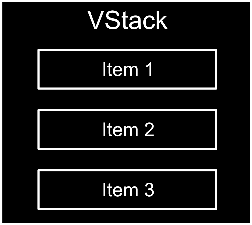
This will be used to organize the controls into rows.
Step 4.3: Break the Construction into Chunks#
While it would be possible to create the entire user interface in this tutorial directly in _build_fn(), as a user interface gets large it can be unwieldy to have it entirely within one function. In order to demonstrate best practices, this tutorial builds each item in the vertical stack above in its own function. Go ahead and edit your code to match the block below:
def _build_fn(self):
    # The method that is called to build all the UI once the window is visible.
    with ui.ScrollingFrame():
        with ui.VStack(height=0):
            self._build_calculations()
            self._build_parameters()
            self._build_light_1()
Each of these functions: _build_calculations(), _build_parameters(), and _build_light_1() builds an item in the vertical stack. Each of those items is a group of well-organized controls made with a consistent look and layout.
If you save window.py it will hot reload, but will not look any different from before. That is because both ScrollingFrame and VStack are layout controls. This means that they are meant to organize content within them, not be displayed themselves. A ScrollingFrame can show a scroll bar, but only if it has content to be scrolled.
Step 5: Build Calculations#
The first group you will create is the Calculations group. In this section CollapsableFrame, HStack, Label, and IntSlider will be introduced. Scroll up to the _build_calculations which looks like the following block of code:
def _build_calculations(self):
    # Build the widgets of the "Calculations" group

        # A VStack is a vertical stack and aligns widgets vertically one after the other

            # An HStack is a horizontal stack and aligns widgets horizontally one after the other

                # A label displays text

                # An IntSlider lets a user choose an integer by sliding a bar back and forth

            # Pairing a label with a control is a common UI comb

                # The label makes the purpose of the control clear

                # You can set the min and max value on an IntSlider
    pass
In the remaining sub-sections you will fill this in and create your first group of controls.
Step 5.1: Create a Collapsible Frame#
Edit _build_calculations() to match the following:
def _build_calculations(self):
    # Build the widgets of the "Calculations" group
    with ui.CollapsableFrame("Calculations", name="group", build_header_fn=self._build_collapsable_header):
        # A VStack is a vertical stack and aligns widgets vertically one after the other

            # An HStack is a horizontal stack and aligns widgets horizontally one after the other

                # A label displays text

                # An IntSlider lets a user choose an integer by sliding a bar back and forth

            # Pairing a label with a control is a common UI comb

                # The label makes the purpose of the control clear

                # You can set the min and max value on an IntSlider
        pass
A CollapsableFrame is a control that you can expand and contract by clicking on its header, which will show or hide its content. The first argument passed into its constructor is the title string. The second argument is its name and the final argument is a reference to the function that builds its header. You can write this function to give the header whatever look you want. At this point if you save window.py and then test in Omniverse Code you will see a change in your extension’s window. The CollapsableFrame will be visible and should look like this:
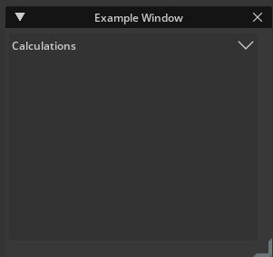
Next we will add content inside this CollapsableFrame.
Step 5.2: Create a Horizontal Stack#
The next three steps demonstrate a very common user interface pattern, which is to have titled controls that are well aligned. A common mistake is to create a user interface that looks like this:
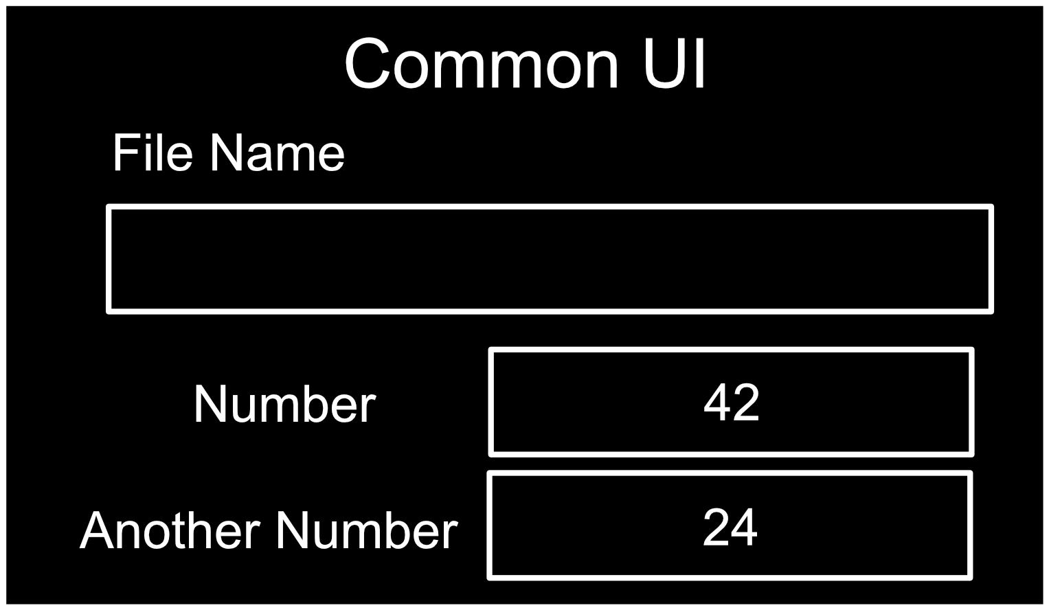
The controls have description labels, but they have inconsistent positions and alignments. The following is a better design:
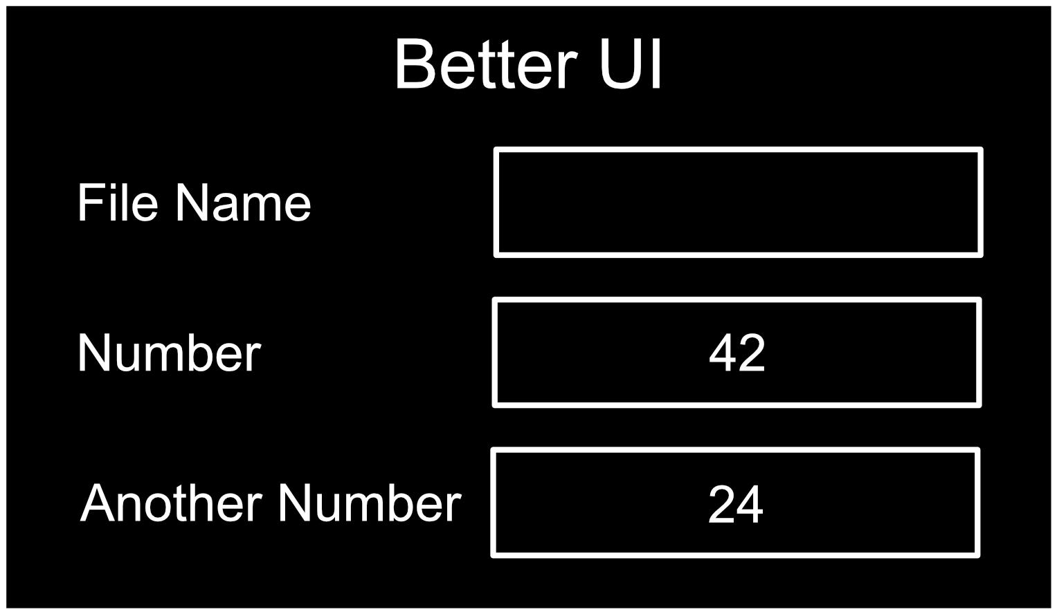
Notice that the description labels are all to the left of their respective controls, the labels are aligned, and the controls have a consistent width.
This will be demonstrated twice within a VStack in this section. Add a VStack and then to create this common description-control layout, add an HStack to the user interface as demonstrated in the following code block:
def _build_calculations(self):
    # Build the widgets of the "Calculations" group
    with ui.CollapsableFrame("Calculations", name="group", build_header_fn=self._build_collapsable_header):
        # A VStack is a vertical stack and aligns widgets vertically one after the other
        with ui.VStack(height=0, spacing=SPACING):
            # An HStack is a horizontal stack and aligns widgets horizontally one after the other
            with ui.HStack():
                # A label displays text

                # An IntSlider allows a user choose an integer by sliding a bar back and forth
            pass

            # Pairing a label with a control is a common UI comb

                # The label makes the purpose of the control clear

                # You can set the min and max value on an IntSlider
        pass
An HStack is very similar to a VStack except that it stacks its content horizontally rather than vertically. Note that a pass you added to the VStack simply so that the code will run until you add more controls to this context.
Step 5.3: Create a Label#
Next add a Label to the HStack:
def _build_calculations(self):
    # Build the widgets of the "Calculations" group
    with ui.CollapsableFrame("Calculations", name="group", build_header_fn=self._build_collapsable_header):
        # A VStack is a vertical stack and aligns widgets vertically one after the other
        with ui.VStack(height=0, spacing=SPACING):
            # An HStack is a horizontal stack and aligns widgets horizontally one after the other
            with ui.HStack():
                # A label displays text
                ui.Label("Precision", name="attribute_name", width=self.label_width)
                # An IntSlider allows a user choose an integer by sliding a bar back and forth

            # Pairing a label with a control is a common UI comb

                # The label makes the purpose of the control clear

                # You can set the min and max value on an IntSlider
If you save the file and go to Code you will see that the Label appears in the user interface. Take special note of the width attribute passed into the constructor. By making all of the labels the same width inside their respective HStack controls, the labels and the controls they describe will be aligned. Note also that all contexts now have code, so we have removed the pass statements.
Step 5.4: Create an IntSlider#
Next add an IntSlider as shown below:
def _build_calculations(self):
    # Build the widgets of the "Calculations" group
    with ui.CollapsableFrame("Calculations", name="group", build_header_fn=self._build_collapsable_header):
        # A VStack is a vertical stack and aligns widgets vertically one after the other
        with ui.VStack(height=0, spacing=SPACING):
            # An HStack is a horizontal stack and aligns widgets horizontally one after the other
            with ui.HStack():
                # A label displays text
                ui.Label("Precision", name="attribute_name", width=self.label_width)
                # An IntSlider allows a user choose an integer by sliding a bar back and forth
                ui.IntSlider(name="attribute_int")
            # Pairing a label with a control is a common UI comb

                # The label makes the purpose of the control clear

                # You can set the min and max value on an IntSlider
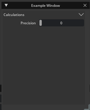
An IntSlider is a slider bar that a user can click and drag to control an integer value. If you save your file and go to Omniverse Code, your user interface should now look like this:
Go ahead and add a second label/control pair by adding the following code:
def _build_calculations(self):
    # Build the widgets of the "Calculations" group
    with ui.CollapsableFrame("Calculations", name="group", build_header_fn=self._build_collapsable_header):
        # A VStack is a vertical stack and aligns widgets vertically one after the other
        with ui.VStack(height=0, spacing=SPACING):
            # An HStack is a horizontal stack and aligns widgets horizontally one after the other
            with ui.HStack():
                # A label displays text
                ui.Label("Precision", name="attribute_name", width=self.label_width)
                # An IntSlider allows a user choose an integer by sliding a bar back and forth
                ui.IntSlider(name="attribute_int")
            # Pairing a label with a control is a common UI comb
            with ui.HStack():
                # The label makes the purpose of the control clear
                ui.Label("Iterations", name="attribute_name", width=self.label_width)
                # You can set the min and max value on an IntSlider
                ui.IntSlider(name="attribute_int", min=0, max=5)
You have added another HStack. This one has a Label set to the same width as the first Label. This gives the group consistent alignment. min and max values have also been set on the second IntSlider as a demonstration. Save window.py and test the extension in Omniverse Code. Expand and collapse the CollapsableFrame, resize the window, and change the integer values. It is a good practice to move and resize your extension windows as you code to make sure that the layout looks good no matter how the user resizes it.
Step 6: Build Parameters#
In this section you will introduce the FloatSlider and demonstrate how to keep the UI consistent across multiple groups. You will be working in the _build_parameters() definition which starts as shown
below:
def _build_parameters(self):
    # Build the widgets of the "Parameters" group

                # A Float Slider is similar to an Int Slider
                # controls a 'float' which is a number with a decimal point (A Real number)

                # You can set the min and max of a float slider as well

            # Setting the labels all to the same width gives the UI a nice alignment

            # A few more examples of float sliders

    pass
Hopefully this is starting to feel a bit more familiar. You have an empty function that has a pass command at the end as a placeholder until you add code to all of its contexts.
Step 6.1: Create a FloatSlider#
A FloatSlider is very similar to an IntSlider. The difference is that it controls a float number rather than an integer. Match the code below to add one to your extension:
def _build_parameters(self):
    # Build the widgets of the "Parameters" group
    with ui.CollapsableFrame("Parameters", name="group", build_header_fn=self._build_collapsable_header):
        with ui.VStack(height=0, spacing=SPACING):
            with ui.HStack():
                ui.Label("Value", name="attribute_name", width=self.label_width)
                # A Float Slider is similar to an Int Slider
                # controls a 'float' which is a number with a decimal point (A Real number)
                ui.FloatSlider(name="attribute_float")
                # You can set the min and max of a float slider as well

            # Setting the labels all to the same width gives the UI a nice alignment

            # A few more examples of float sliders
Here you added a second CollapsableFrame with a VStack inside of it. This will allow you to add as many label/control pairs as you want to this group. Note that the Label has the same width as the label above. Save window.py and you should see the following in Omniverse Code:
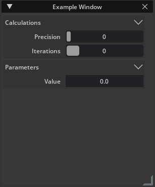
Note that the description labels and controls in the first and second group are aligned with each other.
Step 6.2: Make a Consistent UI#
By using these description control pairs inside of collapsible groups, you can add many controls to a window while maintaining a clean, easy to navigate experience. The following code adds a few more FloatSlider controls to the user interface:
def _build_parameters(self):
    # Build the widgets of the "Parameters" group
    with ui.CollapsableFrame("Parameters", name="group", build_header_fn=self._build_collapsable_header):
        with ui.VStack(height=0, spacing=SPACING):
            with ui.HStack():
                ui.Label("Value", name="attribute_name", width=self.label_width)
                # A Float Slider is similar to an Int Slider
                # controls a 'float' which is a number with a decimal point (A Real number)
                ui.FloatSlider(name="attribute_float")
            with ui.HStack():
                ui.Label("i", name="attribute_name", width=self.label_width)
                # You can set the min and max of a float slider as well
                ui.FloatSlider(name="attribute_float", min=-1, max=1)
            # Setting the labels all to the same width gives the UI a nice alignment
            with ui.HStack():
                ui.Label("j", name="attribute_name", width=self.label_width)
                ui.FloatSlider(name="attribute_float", min=-1, max=1)
            # A few more examples of float sliders
            with ui.HStack():
                ui.Label("k", name="attribute_name", width=self.label_width)
                ui.FloatSlider(name="attribute_float", min=-1, max=1)

            with ui.HStack():
                ui.Label("Theta", name="attribute_name", width=self.label_width)
                ui.FloatSlider(name="attribute_float")
Save window.py and take a look in Omniverse Code. Your window should look like this:
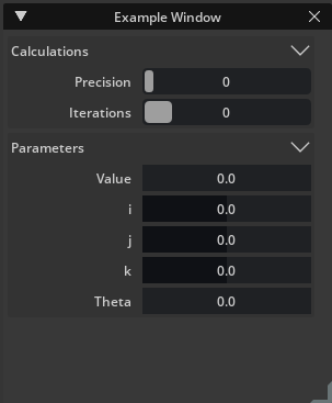
Note that a few of the sliders have min and max values and they they are all well-aligned.
Step 7: Build Light#
In your final group you will add a few other control types to help give you a feel for what can be done in an extension UI. This will also be well-arranged, even though they are different control types to give the overall extension a consistent look and feel, even though it has a variety of control types. You will be working in _build_light_1(), which starts as shown below:
def _build_light_1(self):
    # Build the widgets of the "Light 1" group

                # A multi float drag field lets you control a group of floats

            # Notice what you use the same label width in all of the collapsible frames
            #   This ensures that the entire UI has a consistent feel

            #Feel free to copy this color widget and use it in your own UIs

                # The custom compound widget

            #An example of a checkbox
    pass
First you will add a MultiFloatDragField to it, then a custom color picker widget and finally a Checkbox.
Step 7.1: Create a MultiFloatDragField#
Edit _build_light_1 to match the following:
def _build_light_1(self):
    # Build the widgets of the "Light 1" group
    with ui.CollapsableFrame("Light 1", name="group", build_header_fn=self._build_collapsable_header):
        with ui.VStack(height=0, spacing=SPACING):
            with ui.HStack():
                ui.Label("Orientation", name="attribute_name", width=self.label_width)
                # A multi float drag field allows you control a group of floats (Real numbers)
                ui.MultiFloatDragField(0.0, 0.0, 0.0, h_spacing=SPACING, name="attribute_vector")

            # Notice what you use the same label width in all of the collapsible frames
            #   This ensures that the entire UI has a consistent feel
            with ui.HStack():
                ui.Label("Intensity", name="attribute_name", width=self.label_width)
                ui.FloatSlider(name="attribute_float")

            #Feel free to copy this color widget and use it in your own UIs

                # The custom compound widget

            #An example of a checkbox
This adds a third CollapsableFrame with a VStack to hold its controls. Then it adds a label/control pair with a MultiFloatDragField. A MultiFloatDragField lets a user edit as many values as you put into its constructor, and is commonly used to edit 3-component vectors such as position and rotation.
You also added a second label and control pair with a FloatSlider similar to the one you added in section 6.1.
Step 7.2: Add a Custom Widget#
Developers can create custom widgets and user interface elements. The color picker added in this section is just such an example. Add it to your extension with the following code:
def _build_light_1(self):
    # Build the widgets of the "Light 1" group
    with ui.CollapsableFrame("Light 1", name="group", build_header_fn=self._build_collapsable_header):
        with ui.VStack(height=0, spacing=SPACING):
            with ui.HStack():
                ui.Label("Orientation", name="attribute_name", width=self.label_width)
                # A multi float drag field lets you control a group of floats (Real numbers)
                ui.MultiFloatDragField(0.0, 0.0, 0.0, h_spacing=SPACING, name="attribute_vector")

            # Notice what you use the same label width in all of the collapsible frames
            #   This ensures that the entire UI has a consistent feel
            with ui.HStack():
                ui.Label("Intensity", name="attribute_name", width=self.label_width)
                ui.FloatSlider(name="attribute_float")

            #Feel free to copy this color widget and use it in your own UIs
            with ui.HStack():
                ui.Label("Color", name="attribute_name", width=self.label_width)
                # The custom compound widget
                ColorWidget(0.25, 0.5, 0.75)

            #An example of a checkbox
This widget lets users click and then select a color. Feel free to use this widget in your own applications and feel free to write and share your own widgets. Over time you will have a wide variety of useful widgets and controls for everyone to use in their extensions.
Step 7.3: Add a Checkbox#
Finally, edit _build_light_1() to match the following:
def _build_light_1(self):
    # Build the widgets of the "Light 1" group
    with ui.CollapsableFrame("Light 1", name="group", build_header_fn=self._build_collapsable_header):
        with ui.VStack(height=0, spacing=SPACING):
            with ui.HStack():
                ui.Label("Orientation", name="attribute_name", width=self.label_width)
                # A multi float drag field lets you control a group of floats (Real numbers)
                ui.MultiFloatDragField(0.0, 0.0, 0.0, h_spacing=SPACING, name="attribute_vector")

            # Notice what you use the same label width in all of the collapsible frames
            #   This ensures that the entire UI has a consistent feel
            with ui.HStack():
                ui.Label("Intensity", name="attribute_name", width=self.label_width)
                ui.FloatSlider(name="attribute_float")

            #Feel free to copy this color widget and use it in your own UIs
            with ui.HStack():
                ui.Label("Color", name="attribute_name", width=self.label_width)
                # The custom compound widget
                ColorWidget(0.25, 0.5, 0.75)

            #An example of a checkbox
            with ui.HStack():
                ui.Label("Shadow", name="attribute_name", width=self.label_width)
                ui.CheckBox(name="attribute_bool")
This adds a label/control pair with a CheckBox. A CheckBox control allows a user to set a boolean value.
Save your window.py file and open Omniverse Code. Your user interface should look like this if you collapse the Parameters section:
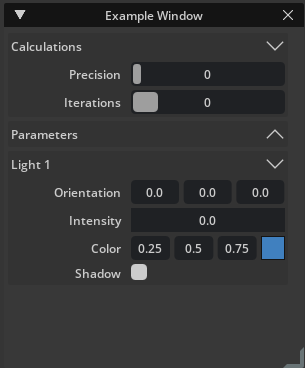
There are three collapsible groups, each with a variety of controls with a variety of settings and yet they are all well-aligned with a consistent look and feel.
Conclusion#
In this tutorial you created an extension user interface using coding best practices to integrate it into an Omniverse application. It contains a variety of controls that edit integers, float, colors and more. These controls are well organized so that a user can easily find their way around the window.
We look forward to seeing the excellent extensions you come up with and how you can help Omniverse users accomplish things that were hard or even impossible to do before you wrote an extension to help them.
