Shapes#
Shapes enable you to build custom widgets with specific looks. There are many shapes you can stylize: Rectangle, Circle, Ellipse, Triangle and FreeShapes of FreeRectangle, FreeCircle, FreeEllipse, FreeTriangle. In most cases those shapes will fit into the widget size which is defined by the parent widget they are in.
The FreeShapes are the shapes that are independent of the layout. It means it can be stuck to other shapes. It means it is possible to stick the freeshape to the layout’s widgets, and the freeshape will follow the changes of the layout automatically.
Common Style of shapes#
Here is a list of common style you can customize on all the Shapes:
background_color (color): the background color of the shape
border_width (float): the border width if the shape has a border
border_color (color): the border color if the shape has a border
Rectangle#
Rectangle is a shape with four sides and four corners. You can use Rectangle to draw rectangle shapes, or mix it with other controls e.g. using ZStack to create an advanced look.
Except the common style for shapes, here is a list of styles you can customize on Rectangle:
background_gradient_color (color): the gradient color on the top part of the rectangle
border_radius (float): default rectangle has 4 right corner angles, border_radius defines the radius of the corner angle if the user wants to round the rectangle corner. We only support one border_radius across all the corners, but users can choose which corner to be rounded.
corner_flag (enum): defines which corner or corners to be rounded
Here is a list of the supported corner flags:
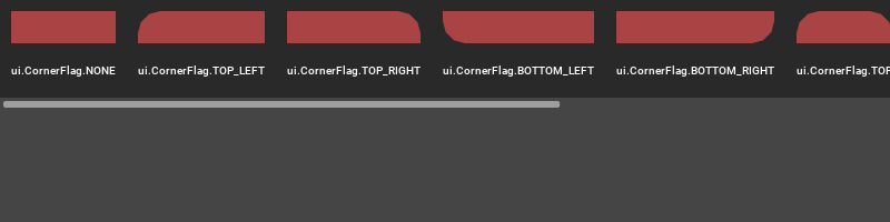
from omni.ui import color as cl
corner_flags = {
    "ui.CornerFlag.NONE": ui.CornerFlag.NONE,
    "ui.CornerFlag.TOP_LEFT": ui.CornerFlag.TOP_LEFT,
    "ui.CornerFlag.TOP_RIGHT": ui.CornerFlag.TOP_RIGHT,
    "ui.CornerFlag.BOTTOM_LEFT": ui.CornerFlag.BOTTOM_LEFT,
    "ui.CornerFlag.BOTTOM_RIGHT": ui.CornerFlag.BOTTOM_RIGHT,
    "ui.CornerFlag.TOP": ui.CornerFlag.TOP,
    "ui.CornerFlag.BOTTOM": ui.CornerFlag.BOTTOM,
    "ui.CornerFlag.LEFT": ui.CornerFlag.LEFT,
    "ui.CornerFlag.RIGHT": ui.CornerFlag.RIGHT,
    "ui.CornerFlag.ALL": ui.CornerFlag.ALL,
}

with ui.ScrollingFrame(
    height=100,
    vertical_scrollbar_policy=ui.ScrollBarPolicy.SCROLLBAR_ALWAYS_OFF,
    style={"ScrollingFrame": {"background_color": cl.transparent}},
):
    with ui.HStack():
        for key, value in corner_flags.items():
            with ui.ZStack():
                ui.Rectangle(name="table")
                with ui.VStack(style={"VStack": {"margin": 10}}):
                    ui.Rectangle(
                        style={"background_color": cl("#aa4444"), "border_radius": 20.0, "corner_flag": value}
                    )
                    ui.Spacer(height=10)
                    ui.Label(key, style={"color": cl.white, "font_size": 12}, alignment=ui.Alignment.CENTER)
Here are a few examples of Rectangle using different selections of styles:
Default rectangle which is scaled to fit:

with ui.Frame(height=20):
    ui.Rectangle(name="default")
This rectangle uses its own style to control colors and shape. Notice how three colors “background_color”, “border_color” and “border_color” are affecting the look of the rectangle:
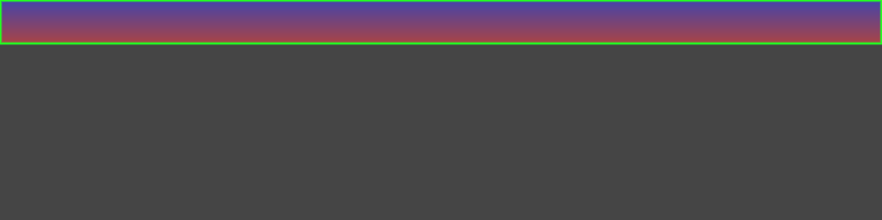
from omni.ui import color as cl
with ui.Frame(height=40):
    ui.Rectangle(style={"Rectangle":{
        "background_color":cl("#aa4444"),
        "border_color":cl("#22FF22"),
        "background_gradient_color": cl("#4444aa"),
        "border_width": 2.0,
        "border_radius": 5.0}})
This rectangle uses fixed width and height. Notice the border_color is not doing anything if border_width is not defined.
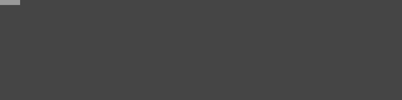
from omni.ui import color as cl
with ui.Frame(height=20):
    ui.Rectangle(width=40, height=10, style={"background_color":cl(0.6), "border_color":cl("#ff2222")})
Compose with ZStack for an advanced look
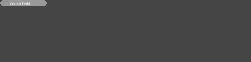
from omni.ui import color as cl
with ui.Frame(height=20):
    with ui.ZStack(height=20):
        ui.Rectangle(width=150,
            style={"background_color":cl(0.6),
                    "border_color":cl(0.1),
                    "border_width": 1.0,
                    "border_radius": 8.0} )
        with ui.HStack():
            ui.Spacer(width=10)
            ui.Image("resources/icons/Cloud.png", width=20, height=20 )
            ui.Label( "Search Field", style={"color":cl(0.875)})
FreeRectangle#
FreeRectangle is a rectangle whose width and height will be determined by other widgets. The supported style list is the same as Rectangle.
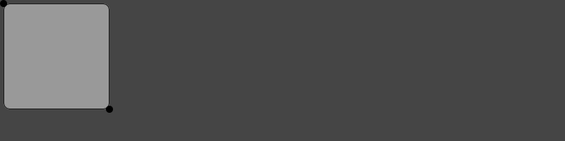
Here is an example of a FreeRectangle with style following two draggable circles:
from omni.ui import color as cl
with ui.Frame(height=200):
    with ui.ZStack():
        # Four draggable rectangles that represent the control points
        with ui.Placer(draggable=True, offset_x=0, offset_y=0):
            control1 = ui.Circle(width=10, height=10)
        with ui.Placer(draggable=True, offset_x=150, offset_y=150):
            control2 = ui.Circle(width=10, height=10)

        # The rectangle that fits to the control points
        ui.FreeRectangle(control1, control2, style={
                    "background_color":cl(0.6),
                    "border_color":cl(0.1),
                    "border_width": 1.0,
                    "border_radius": 8.0})
Circle#
You can use Circle to draw a circular shape. Circle doesn’t have any other style except the common style for shapes.
Here is some of the properties you can customize on Circle:
size_policy (enum): there are two types of the size_policy, fixed and stretch.
ui.CircleSizePolicy.FIXED: the size of the circle is defined by the radius and is fixed without being affected by the parent scaling.
ui.CircleSizePolicy.STRETCH: the size of the circle is defined by the parent and will be stretched if the parent widget size changed.
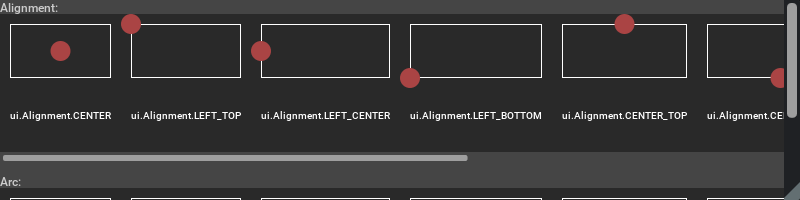
alignment (enum): the position of the circle in the parent defined space
arc (enum): this property defines the way to draw a half or a quarter of the circle.
Here is a list of the supported Alignment and Arc value for the Circle:
from omni.ui import color as cl
alignments = {
    "ui.Alignment.CENTER": ui.Alignment.CENTER,
    "ui.Alignment.LEFT_TOP": ui.Alignment.LEFT_TOP,
    "ui.Alignment.LEFT_CENTER": ui.Alignment.LEFT_CENTER,
    "ui.Alignment.LEFT_BOTTOM": ui.Alignment.LEFT_BOTTOM,
    "ui.Alignment.CENTER_TOP": ui.Alignment.CENTER_TOP,
    "ui.Alignment.CENTER_BOTTOM": ui.Alignment.CENTER_BOTTOM,
    "ui.Alignment.RIGHT_TOP": ui.Alignment.RIGHT_TOP,
    "ui.Alignment.RIGHT_CENTER": ui.Alignment.RIGHT_CENTER,
    "ui.Alignment.RIGHT_BOTTOM": ui.Alignment.RIGHT_BOTTOM,
}
ui.Label("Alignment: ")
with ui.ScrollingFrame(
    height=150,
    vertical_scrollbar_policy=ui.ScrollBarPolicy.SCROLLBAR_ALWAYS_OFF,
    style={"ScrollingFrame": {"background_color": cl.transparent}},
):
    with ui.HStack():
        for key, value in alignments.items():
            with ui.ZStack():
                ui.Rectangle(name="table")
                with ui.VStack(style={"VStack": {"margin": 10}}, spacing=10):
                    with ui.ZStack():
                        ui.Rectangle(name="table", style={"border_color":cl.white, "border_width": 1.0})
                        ui.Circle(
                            radius=10,
                            size_policy=ui.CircleSizePolicy.FIXED,
                            name="orientation",
                            alignment=value,
                            style={"background_color": cl("#aa4444")},
                        )
                    ui.Label(key, style={"color": cl.white, "font_size": 12}, alignment=ui.Alignment.CENTER)
ui.Spacer(height=10)
ui.Label("Arc: ")
with ui.ScrollingFrame(
    height=150,
    vertical_scrollbar_policy=ui.ScrollBarPolicy.SCROLLBAR_ALWAYS_OFF,
    style={"ScrollingFrame": {"background_color": cl.transparent}},
):
    with ui.HStack():
        for key, value in alignments.items():
            with ui.ZStack():
                ui.Rectangle(name="table")
                with ui.VStack(style={"VStack": {"margin": 10}}, spacing=10):
                    with ui.ZStack():
                        ui.Rectangle(name="table", style={"border_color":cl.white, "border_width": 1.0})
                        ui.Circle(
                            radius=10,
                            size_policy=ui.CircleSizePolicy.FIXED,
                            name="orientation",
                            arc=value,
                            style={
                                "background_color": cl("#aa4444"),
                                "border_color": cl.blue,
                                "border_width": 2,
                                },
                        )
                    ui.Label(key, style={"color": cl.white, "font_size": 12}, alignment=ui.Alignment.CENTER)
Default circle which is scaled to fit, the alignment is centered:

with ui.Frame(height=20):
    ui.Circle(name="default")
This circle is scaled to fit with 100 height:

with ui.Frame(height=100):
    ui.Circle(name="default")
This circle has a fixed radius of 20, the alignment is LEFT_CENTER:
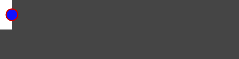
from omni.ui import color as cl
style = {"Circle": {"background_color": cl("#1111ff"), "border_color": cl("#cc0000"), "border_width": 4}}
with ui.Frame(height=100, style=style):
    with ui.HStack():
        ui.Rectangle(width=40, style={"background_color": cl.white})
        ui.Circle(radius=20, size_policy=ui.CircleSizePolicy.FIXED, alignment=ui.Alignment.LEFT_CENTER)
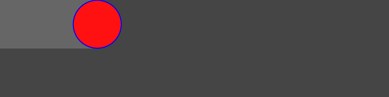
This circle has a fixed radius of 10, the alignment is RIGHT_CENTER
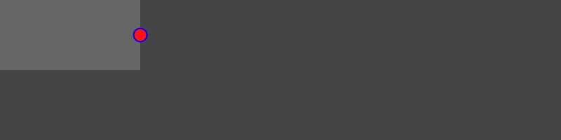
from omni.ui import color as cl
style = {"Circle": {"background_color": cl("#ff1111"), "border_color": cl.blue, "border_width": 2}}
with ui.Frame(height=100, width=200, style=style):
    with ui.ZStack():
        ui.Rectangle(style={"background_color": cl(0.4)})
        ui.Circle(radius=10, size_policy=ui.CircleSizePolicy.FIXED, alignment=ui.Alignment.RIGHT_CENTER)
This circle has a fixed radius of 10, it has all the same style as the previous one, except its size_policy is ui.CircleSizePolicy.STRETCH
from omni.ui import color as cl
style = {"Circle": {"background_color": cl("#ff1111"), "border_color": cl.blue, "border_width": 2}}
with ui.Frame(height=100, width=200, style=style):
    with ui.ZStack():
        ui.Rectangle(style={"background_color": cl(0.4)})
        ui.Circle(radius=10, size_policy=ui.CircleSizePolicy.STRETCH, alignment=ui.Alignment.RIGHT_CENTER)
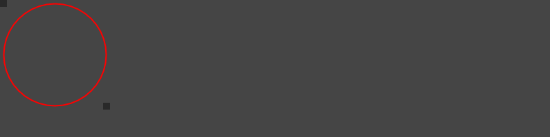
FreeCircle#
FreeCircle is a circle whose radius will be determined by other widgets. The supported style list is the same as Circle.
Here is an example of a FreeCircle with style following two draggable rectangles:
from omni.ui import color as cl
with ui.Frame(height=200):
    with ui.ZStack():
        # Four draggable rectangles that represent the control points
        with ui.Placer(draggable=True, offset_x=0, offset_y=0):
            control1 = ui.Rectangle(width=10, height=10)
        with ui.Placer(draggable=True, offset_x=150, offset_y=150):
            control2 = ui.Rectangle(width=10, height=10)

        # The rectangle that fits to the control points
        ui.FreeCircle(control1, control2, style={
                    "background_color":cl.transparent,
                    "border_color":cl.red,
                    "border_width": 2.0})
Ellipse#
Ellipse is drawn in a rectangle bounding box, and It is always scaled to fit the rectangle’s width and height. Ellipse doesn’t have any other style except the common style for shapes.
Default ellipse is scaled to fit:
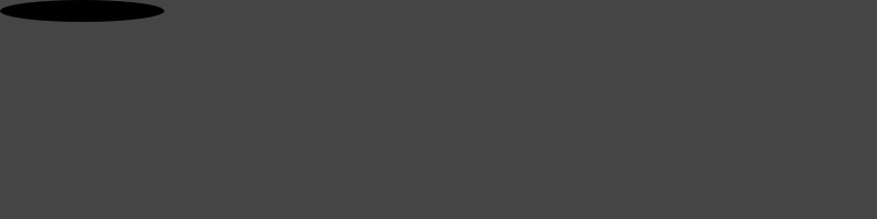
with ui.Frame(height=20, width=150):
    ui.Ellipse(name="default")
Stylish ellipse with border and colors:
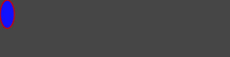
from omni.ui import color as cl
style = {"Ellipse": {"background_color": cl("#1111ff"), "border_color": cl("#cc0000"), "border_width": 4}}
with ui.Frame(height=100, width=50):
    ui.Ellipse(style=style)
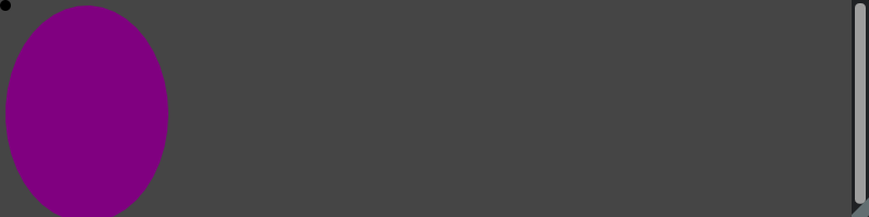
FreeEllipse#
FreeEllipse is an ellipse whose width and height will be determined by other widgets. The supported style list is the same as Ellipse.
Here is an example of a FreeEllipse with style following two draggable circles:
from omni.ui import color as cl
with ui.Frame(height=200):
    with ui.ZStack():
        # Four draggable rectangles that represent the control points
        with ui.Placer(draggable=True, offset_x=0, offset_y=0):
            control1 = ui.Circle(width=10, height=10)
        with ui.Placer(draggable=True, offset_x=150, offset_y=200):
            control2 = ui.Circle(width=10, height=10)

        # The rectangle that fits to the control points
        ui.FreeEllipse(control1, control2, style={
                    "background_color":cl.purple})
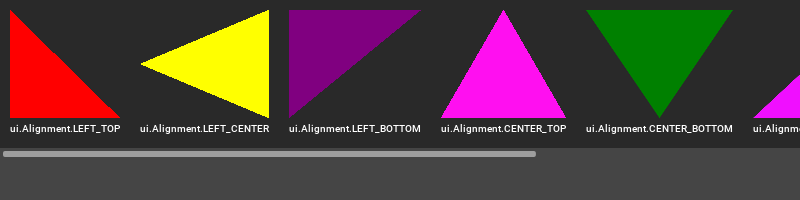
Triangle#
You can use Triangle to draw Triangle shape. Triangle doesn’t have any other style except the common style for shapes.
Here is some of the properties you can customize on Triangle:
alignment (enum): the alignment defines where the tip of the triangle is, base will be at the opposite side
Here is a list of the supported alignment value for the triangle:
from omni.ui import color as cl
alignments = {
    "ui.Alignment.LEFT_TOP": ui.Alignment.LEFT_TOP,
    "ui.Alignment.LEFT_CENTER": ui.Alignment.LEFT_CENTER,
    "ui.Alignment.LEFT_BOTTOM": ui.Alignment.LEFT_BOTTOM,
    "ui.Alignment.CENTER_TOP": ui.Alignment.CENTER_TOP,
    "ui.Alignment.CENTER_BOTTOM": ui.Alignment.CENTER_BOTTOM,
    "ui.Alignment.RIGHT_TOP": ui.Alignment.RIGHT_TOP,
    "ui.Alignment.RIGHT_CENTER": ui.Alignment.RIGHT_CENTER,
    "ui.Alignment.RIGHT_BOTTOM": ui.Alignment.RIGHT_BOTTOM,
}
colors = [cl.red, cl.yellow, cl.purple, cl("#ff0ff0"), cl.green, cl("#f00fff"), cl("#fff000"), cl("#aa3333")]
index = 0
with ui.ScrollingFrame(
    height=160,
    vertical_scrollbar_policy=ui.ScrollBarPolicy.SCROLLBAR_ALWAYS_OFF,
    style={"ScrollingFrame": {"background_color": cl.transparent}},
):
    with ui.HStack():
        for key, value in alignments.items():
            with ui.ZStack():
                ui.Rectangle(name="table")
                with ui.VStack(style={"VStack": {"margin": 10}}):
                    color = colors[index]
                    index = index + 1
                    ui.Triangle(alignment=value, style={"Triangle":{"background_color": color}})
                    ui.Label(key, style={"color": cl.white, "font_size": 12}, alignment=ui.Alignment.CENTER, height=20)
Here are a few examples of Triangle using different selections of styles:
The triangle is scaled to fit, base on the left and tip on the center right. Users can define the border_color and border_width but without background_color to make the triangle look like it’s drawn in wireframe style.
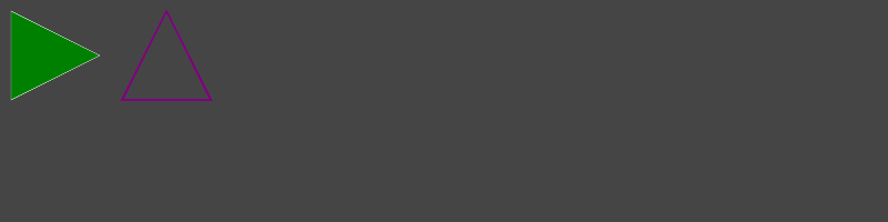
from omni.ui import color as cl
style = {
    "Triangle::default":
    {
        "background_color": cl.green,
        "border_color": cl.white,
        "border_width": 1
    },
    "Triangle::transparent":
    {
        "border_color": cl.purple,
        "border_width": 4,
    },
}
with ui.Frame(height=100, width=200, style=style):
    with ui.HStack(spacing=10, style={"margin": 5}):
        ui.Triangle(name="default")
        ui.Triangle(name="transparent", alignment=ui.Alignment.CENTER_TOP)
FreeTriangle#
FreeTriangle is a triangle whose width and height will be determined by other widgets. The supported style list is the same as Triangle.
Here is an example of a FreeTriangle with style following two draggable rectangles. The default alignment is ui.Alignment.RIGHT_CENTER. We make the alignment as ui.Alignment.CENTER_BOTTOM.
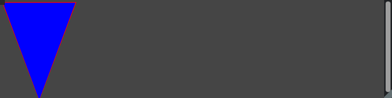
from omni.ui import color as cl
with ui.Frame(height=200):
    with ui.ZStack():
        # Four draggable rectangles that represent the control points
        with ui.Placer(draggable=True, offset_x=0, offset_y=0):
            control1 = ui.Rectangle(width=10, height=10)
        with ui.Placer(draggable=True, offset_x=150, offset_y=200):
            control2 = ui.Rectangle(width=10, height=10)

        # The rectangle that fits to the control points
        ui.FreeTriangle(control1, control2, alignment=ui.Alignment.CENTER_BOTTOM, style={
                    "background_color":cl.blue,
                    "border_color":cl.red,
                    "border_width": 2.0})